Enhanced phenology data
In Klein-Altendorf, limited temperature variation makes it difficult to analyze phenology responses to chill and heat. To enhance the data, a two-winter experiment was conducted at Campus Klein-Altendorf (Fernandez et al., 2021). Young potted trees were exposed to different controlled environments during winter. In the 2018/2019 season, three environments were used, and in 2019/2020, four additional environments were introduced, including three chambers with different materials and an outdoor setting at Campus Endenich, University of Bonn. By moving trees between environments, 66 experimental seasons for apples and 33 for pears were created.
The following plot provides a schematic (animated) representation of the experiment using ggplot2 and gganimate.
data <- read.csv("data/interactive_plot_PLS.csv", sep = ";")

# This part is to re-code the different conditions
data[which(data$Final_Condition == "Outside"), "Final_condition_2"] <- 1
data[which(data$Final_Condition == "Un-heated"), "Final_condition_2"] <- 2
data[which(data$Final_Condition == "Heated"), "Final_condition_2"] <- 3

# Implement the plot
ggplot(data, aes(Day, Final_condition_2, color = factor(Treatment, levels = c(1 : 33)))) +
  geom_jitter(size = 4) +
  geom_path(size = 1) +
  scale_y_continuous(breaks = c(1, 2, 3),
                     labels = c("Outside", "Un-Heated", "Heated")) +
  scale_x_continuous(breaks = as.numeric(levels(as.factor(data$Day))),
                     labels = levels(as.factor(data$Day))) +
  labs(x = "Days of experiment", y = "Condition", color = "Treatment") +
  theme_bw() +
  theme(axis.text.y = element_text(angle = 90, hjust = 0.5),
        legend.position = "none") +
  transition_reveal(Day)

anim_save("data/interactive_experiment_plot.gif",
          animation = last_animation())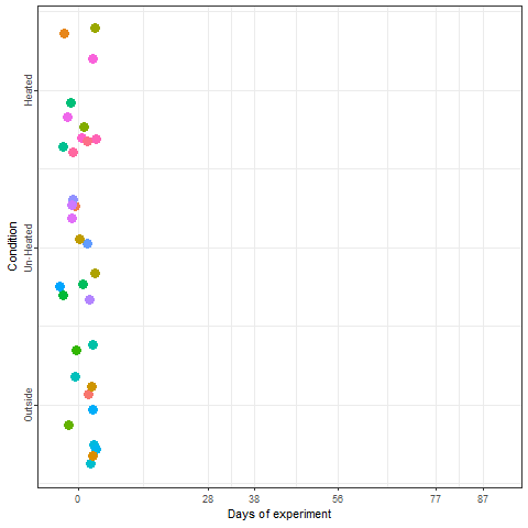
The bloom dates of the trees were recorded following exposure to various winter temperature patterns, resulting in significant differences in bloom timing.
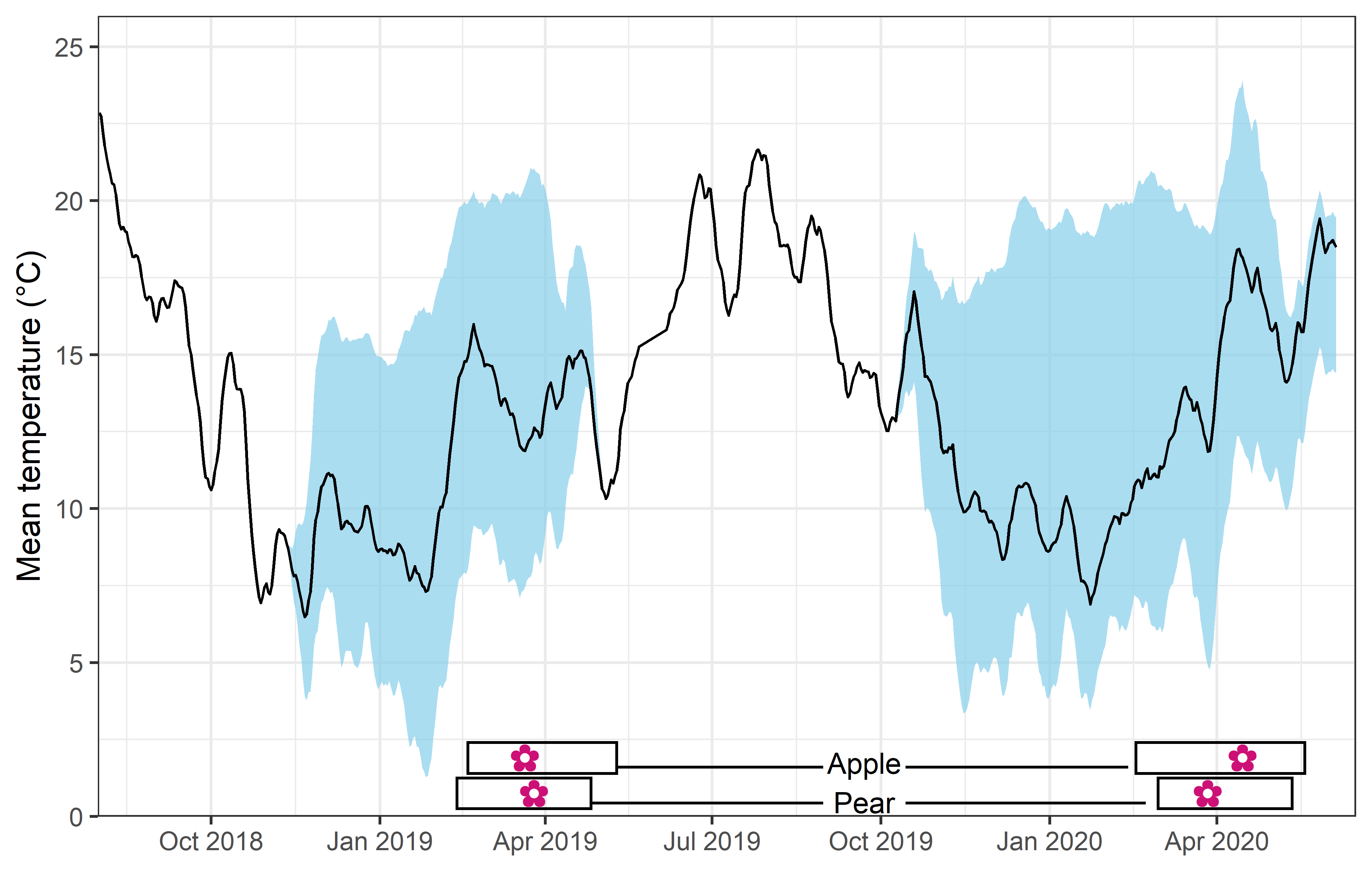
The plot above illustrates the mean temperature (solid line), the range of mean temperatures (sky blue shade), and the range of bloom dates (rectangles at the bottom) across different treatments over two winters.
The next step is to examine key findings from the study, which involves loading the weather files and the dataset containing flowering date observations for apples, saved in the data directory.
Several functions from previous chapters are required for the analysis:
ggplot_PLS(from Delineating temperature response phases with PLS regression)plot_PLS_chill_force(from PLS regression with agroclimatic metrics)pheno_trend_ggplot(from Evaluating PLS outputs)Chill_model_sensitivityandChill_sensitivity_temps(both from Why PLS doesn’t always work)
These functions are being reloaded with suppressed output for clarity. Before conducting the PLS analysis, some preprocessing of the dataset is necessary, which will be explained in detail during the class.
ggplot_PLS <- function(PLS_results)
{
  library(ggplot2)
  PLS_gg <- PLS_results$PLS_summary
  PLS_gg[,"Month"]<-trunc(PLS_gg$Date/100)
  PLS_gg[,"Day"]<-PLS_gg$Date-PLS_gg$Month*100
  PLS_gg[,"Date"]<-ISOdate(2002,PLS_gg$Month,PLS_gg$Day)
  PLS_gg[which(PLS_gg$JDay<=0),"Date"]<-ISOdate(2001,PLS_gg$Month[which(PLS_gg$JDay<=0)],PLS_gg$Day[which(PLS_gg$JDay<=0)])
  PLS_gg[,"VIP_importance"]<-PLS_gg$VIP>=0.8
  PLS_gg[,"VIP_Coeff"]<-factor(sign(PLS_gg$Coef)*PLS_gg$VIP_importance)

  VIP_plot<- ggplot(PLS_gg,aes(x=Date,y=VIP)) +
  geom_bar(stat='identity',aes(fill=VIP>0.8)) +
  scale_fill_manual(name="VIP",
                    labels = c("<0.8", ">0.8"),
                    values = c("FALSE"="grey", "TRUE"="blue")) +
  theme_bw(base_size=15) +
  theme(axis.text.x = element_blank(),
        axis.ticks.x = element_blank(),
        axis.title.x = element_blank() )

  coeff_plot<- ggplot(PLS_gg,aes(x=Date,y=Coef)) +
  geom_bar(stat='identity',aes(fill=VIP_Coeff)) +
  scale_fill_manual(name="Effect direction",
                    labels = c("Advancing", "Unimportant","Delaying"),
                    values = c("-1"="red", "0"="grey","1"="dark green")) +
  theme_bw(base_size=15) +
  ylab("PLS coefficient") +
  theme(axis.text.x = element_blank(),
        axis.ticks.x = element_blank(),
        axis.title.x = element_blank() )

  temp_plot<- ggplot(PLS_gg) +
    geom_ribbon(aes(x=Date,ymin=Tmean-Tstdev,ymax=Tmean+Tstdev),fill="grey") +
    geom_ribbon(aes(x=Date,ymin=Tmean-Tstdev*(VIP_Coeff==-1),ymax=Tmean+Tstdev*(VIP_Coeff==-1)),fill="red") +
    geom_ribbon(aes(x=Date,ymin=Tmean-Tstdev*(VIP_Coeff==1),ymax=Tmean+Tstdev*(VIP_Coeff==1)),fill="dark green") +
    geom_line(aes(x=Date,y=Tmean)) +
    theme_bw(base_size=15) +
    ylab(expression(paste(T[mean]," (°C)")))

  library(patchwork)
  plot<- (VIP_plot +
            coeff_plot +
            temp_plot +
            plot_layout(ncol=1,
                        guides = "collect")
          ) & theme(legend.position = "right",
                    legend.text = element_text(size=8),
                    legend.title = element_text(size=10),
                    axis.title.x=element_blank())

plot
}

plot_PLS_chill_force<-function(plscf,
                               chill_metric="Chill_Portions",
                               heat_metric="GDH",
                               chill_label="CP",
                               heat_label="GDH",
                               chill_phase=c(-48,62),
                               heat_phase=c(-5,105.5))
{
  PLS_gg<-plscf[[chill_metric]][[heat_metric]]$PLS_summary
  PLS_gg[,"Month"]<-trunc(PLS_gg$Date/100)
  PLS_gg[,"Day"]<-PLS_gg$Date-PLS_gg$Month*100
  PLS_gg[,"Date"]<-ISOdate(2002,PLS_gg$Month,PLS_gg$Day)
  PLS_gg[which(PLS_gg$JDay<=0),"Date"]<-ISOdate(2001,PLS_gg$Month[which(PLS_gg$JDay<=0)],PLS_gg$Day[which(PLS_gg$JDay<=0)])
  PLS_gg[,"VIP_importance"]<-PLS_gg$VIP>=0.8
  PLS_gg[,"VIP_Coeff"]<-factor(sign(PLS_gg$Coef)*PLS_gg$VIP_importance)

  chill_start_date<-ISOdate(2001,12,31)+chill_phase[1]*24*3600
  chill_end_date<-ISOdate(2001,12,31)+chill_phase[2]*24*3600
  heat_start_date<-ISOdate(2001,12,31)+heat_phase[1]*24*3600
  heat_end_date<-ISOdate(2001,12,31)+heat_phase[2]*24*3600


  temp_plot<- ggplot(PLS_gg) +
    annotate("rect",
             xmin = chill_start_date,
             xmax = chill_end_date,
             ymin = -Inf,
             ymax = Inf,
             alpha = .1,fill = "blue") +
    annotate("rect",
             xmin = heat_start_date,
             xmax = heat_end_date,
             ymin = -Inf,
             ymax = Inf,
             alpha = .1,fill = "red") +
    annotate("rect",
             xmin = ISOdate(2001,12,31) + min(plscf$pheno$pheno,na.rm=TRUE)*24*3600,
             xmax = ISOdate(2001,12,31) + max(plscf$pheno$pheno,na.rm=TRUE)*24*3600,
             ymin = -Inf,
             ymax = Inf,
             alpha = .1,fill = "black") +
    geom_vline(xintercept = ISOdate(2001,12,31) + median(plscf$pheno$pheno,na.rm=TRUE)*24*3600, linetype = "dashed") +
    geom_ribbon(aes(x=Date,
                    ymin=MetricMean - MetricStdev ,
                    ymax=MetricMean + MetricStdev ),
                fill="grey") +
    geom_ribbon(aes(x=Date,
                    ymin=MetricMean - MetricStdev * (VIP_Coeff==-1),
                    ymax=MetricMean + MetricStdev * (VIP_Coeff==-1)),
                fill="red") +
    geom_ribbon(aes(x=Date,
                    ymin=MetricMean - MetricStdev * (VIP_Coeff==1),
                    ymax=MetricMean + MetricStdev * (VIP_Coeff==1)),
                fill="dark green") +
    geom_line(aes(x=Date,y=MetricMean )) +
    facet_wrap(vars(Type), scales = "free_y",
               strip.position="left",
               labeller = labeller(Type = as_labeller(c(Chill=paste0("Chill (",chill_label,")"),Heat=paste0("Heat (",heat_label,")")) )) ) +
    ggtitle("Daily chill and heat accumulation rates") +
    theme_bw(base_size=15) +
    theme(strip.background = element_blank(),
          strip.placement = "outside",
          strip.text.y = element_text(size =12),
          plot.title = element_text(hjust = 0.5),
          axis.title.y=element_blank()
          )

  VIP_plot<- ggplot(PLS_gg,aes(x=Date,y=VIP)) +
    annotate("rect",
             xmin = chill_start_date,
             xmax = chill_end_date,
             ymin = -Inf,
             ymax = Inf,
             alpha = .1,fill = "blue") +
    annotate("rect",
             xmin = heat_start_date,
             xmax = heat_end_date,
             ymin = -Inf,
             ymax = Inf,
             alpha = .1,fill = "red") +
    annotate("rect",
             xmin = ISOdate(2001,12,31) + min(plscf$pheno$pheno,na.rm=TRUE)*24*3600,
             xmax = ISOdate(2001,12,31) + max(plscf$pheno$pheno,na.rm=TRUE)*24*3600,
             ymin = -Inf,
             ymax = Inf,
             alpha = .1,fill = "black") +
    geom_vline(xintercept = ISOdate(2001,12,31) + median(plscf$pheno$pheno,na.rm=TRUE)*24*3600, linetype = "dashed") +
    geom_bar(stat='identity',aes(fill=VIP>0.8)) +
    facet_wrap(vars(Type), scales="free",
               strip.position="left",
               labeller = labeller(Type = as_labeller(c(Chill="VIP for chill",Heat="VIP for heat") )) ) +
    scale_y_continuous(limits=c(0,max(plscf[[chill_metric]][[heat_metric]]$PLS_summary$VIP))) +
    ggtitle("Variable Importance in the Projection (VIP) scores") +
    theme_bw(base_size=15) +
    theme(strip.background = element_blank(),
          strip.placement = "outside",
          strip.text.y = element_text(size =12),
          plot.title = element_text(hjust = 0.5),
          axis.title.y=element_blank()
          ) +
    scale_fill_manual(name="VIP",
                      labels = c("<0.8", ">0.8"),
                      values = c("FALSE"="grey", "TRUE"="blue")) +
    theme(axis.text.x = element_blank(),
          axis.ticks.x = element_blank(),
          axis.title.x = element_blank(),
          axis.title.y = element_blank())

  coeff_plot<- ggplot(PLS_gg,aes(x=Date,y=Coef)) +
    annotate("rect",
             xmin = chill_start_date,
             xmax = chill_end_date,
             ymin = -Inf,
             ymax = Inf,
             alpha = .1,fill = "blue") +
    annotate("rect",
             xmin = heat_start_date,
             xmax = heat_end_date,
             ymin = -Inf,
             ymax = Inf,
             alpha = .1,fill = "red") +
    annotate("rect",
             xmin = ISOdate(2001,12,31) + min(plscf$pheno$pheno,na.rm=TRUE)*24*3600,
             xmax = ISOdate(2001,12,31) + max(plscf$pheno$pheno,na.rm=TRUE)*24*3600,
             ymin = -Inf,
             ymax = Inf,
             alpha = .1,fill = "black") +
    geom_vline(xintercept = ISOdate(2001,12,31) + median(plscf$pheno$pheno,na.rm=TRUE)*24*3600, linetype = "dashed") +
    geom_bar(stat='identity',aes(fill=VIP_Coeff)) +
    facet_wrap(vars(Type), scales="free",
               strip.position="left",
               labeller = labeller(Type = as_labeller(c(Chill="MC for chill",Heat="MC for heat") )) ) +
    scale_y_continuous(limits=c(min(plscf[[chill_metric]][[heat_metric]]$PLS_summary$Coef),
                                max(plscf[[chill_metric]][[heat_metric]]$PLS_summary$Coef))) +
    ggtitle("Model coefficients (MC)") +
    theme_bw(base_size=15) +
    theme(strip.background = element_blank(),
          strip.placement = "outside",
          strip.text.y = element_text(size =12),
          plot.title = element_text(hjust = 0.5),
          axis.title.y=element_blank()
          ) +
    scale_fill_manual(name="Effect direction",
                      labels = c("Advancing", "Unimportant","Delaying"),
                      values = c("-1"="red", "0"="grey","1"="dark green")) +
    ylab("PLS coefficient") +
    theme(axis.text.x = element_blank(),
          axis.ticks.x = element_blank(),
          axis.title.x = element_blank(),
          axis.title.y = element_blank())

  library(patchwork)

  plot<- (VIP_plot +
            coeff_plot +
            temp_plot +
            plot_layout(ncol=1,
                        guides = "collect")
          ) & theme(legend.position = "right",
                    legend.text = element_text(size=8),
                    legend.title = element_text(size=10),
                    axis.title.x=element_blank())

plot

}


pheno_trend_ggplot<-function(temps,
                             pheno,
                             chill_phase,
                             heat_phase,
                             exclude_years=NA,
                             phenology_stage="Bloom")
{
  library(fields)
  library(reshape2)
  library(metR)
  library(ggplot2)
  library(colorRamps)

  # first, a sub-function (function defined within a function) to
  # compute the temperature means

  mean_temp_period<-function(temps,
                             start_JDay,
                             end_JDay,
                             end_season = end_JDay)
    { temps_JDay<-make_JDay(temps)
    temps_JDay[,"Season"]<-temps_JDay$Year
    if(start_JDay>end_season)
      temps_JDay$Season[which(temps_JDay$JDay>=start_JDay)]<-
      temps_JDay$Year[which(temps_JDay$JDay>=start_JDay)]+1
    if(start_JDay>end_JDay)
      sub_temps<-subset(temps_JDay,JDay<=end_JDay|JDay>=start_JDay)
    if(start_JDay<=end_JDay)
      sub_temps<-subset(temps_JDay,JDay<=end_JDay&JDay>=start_JDay)
    mean_temps<-aggregate(sub_temps[,c("Tmin","Tmax")],
                          by=list(sub_temps$Season),
                          FUN=function(x) mean(x, na.rm=TRUE))
    mean_temps[,"n_days"]<-aggregate(sub_temps[,"Tmin"],
                                     by=list(sub_temps$Season),
                                     FUN=length)[,2]
    mean_temps[,"Tmean"]<-(mean_temps$Tmin+mean_temps$Tmax)/2
    mean_temps<-mean_temps[,c(1,4,2,3,5)]
    colnames(mean_temps)[1]<-"End_year"
    return(mean_temps)
    }

  mean_temp_chill<-mean_temp_period(temps = temps,
                                    start_JDay = chill_phase[1],
                                    end_JDay = chill_phase[2],
                                    end_season = heat_phase[2])

  mean_temp_heat<-mean_temp_period(temps = temps,
                                   start_JDay = heat_phase[1],
                                   end_JDay = heat_phase[2],
                                   end_season = heat_phase[2])

  mean_temp_chill<-
    mean_temp_chill[which(mean_temp_chill$n_days >=
                            max(mean_temp_chill$n_days)-1),]
  mean_temp_heat<-
    mean_temp_heat[which(mean_temp_heat$n_days >=
                           max(mean_temp_heat$n_days)-1),]
  mean_chill<-mean_temp_chill[,c("End_year","Tmean")]
  colnames(mean_chill)[2]<-"Tmean_chill"
  mean_heat<-mean_temp_heat[,c("End_year","Tmean")]
  colnames(mean_heat)[2]<-"Tmean_heat"
  phase_Tmeans<-merge(mean_chill,mean_heat, by="End_year")

  colnames(pheno)<-c("End_year","pheno")
  Tmeans_pheno<-merge(phase_Tmeans,pheno, by="End_year")

  if(!is.na(exclude_years[1]))
    Tmeans_pheno<-Tmeans_pheno[which(!Tmeans_pheno$End_year %in% exclude_years),]

  # Kriging interpolation
  k<-Krig(x=as.matrix(Tmeans_pheno[,c("Tmean_chill","Tmean_heat")]),
          Y=Tmeans_pheno$pheno)
  pred<-predictSurface(k)
  predictions<-as.data.frame(pred$z)

  colnames(predictions) <- pred$y
  predictions <- data.frame(Tmean_chill = pred$x, predictions)

  melted<-melt(predictions,na.rm=TRUE,id.vars="Tmean_chill")
  colnames(melted)<-c("Tmean_chill","Tmean_heat","value")
  melted$Tmean_heat<-unique(pred$y)[as.numeric(melted$Tmean_heat)]


  ggplot(melted,aes(x=Tmean_chill,y=Tmean_heat,z=value)) +
    geom_contour_fill(bins=60) +
    scale_fill_gradientn(colours=alpha(matlab.like(15)),
                         name=paste(phenology_stage,"date \n(day of the year)")) +
    geom_contour(col="black") +
    geom_text_contour(stroke = 0.2) +
    geom_point(data=Tmeans_pheno,
               aes(x=Tmean_chill,y=Tmean_heat,z=NULL),
               size=0.7)  +
    ylab(expression(paste("Forcing phase ", T[mean]," (",degree,"C)"))) +
    xlab(expression(paste("Chilling phase ", T[mean]," (",degree,"C)"))) +
    theme_bw(base_size=15)
}

Chill_model_sensitivity<-function(latitude,
                                  temp_models=list(Dynamic_Model=Dynamic_Model,GDH=GDH),
                                  month_range=c(10,11,12,1,2,3),
                                  Tmins=c(-10:20),
                                  Tmaxs=c(-5:30))
  {
  mins<-NA
  maxs<-NA
  metrics<-as.list(rep(NA,length(temp_models)))
  names(metrics)<-names(temp_models)
  month<-NA

  for(mon in month_range)
    {
    days_month<-as.numeric(difftime( ISOdate(2002,mon+1,1),
                                      ISOdate(2002,mon,1) ))
    if(mon==12) days_month<-31
    weather<-make_all_day_table(data.frame(Year=c(2001,2002),
                                           Month=c(mon,mon),
                                           Day=c(1,days_month),
                                           Tmin=c(0,0),Tmax=c(0,0)))


    for(tmin in Tmins)
      for(tmax in Tmaxs)
        if(tmax>=tmin)
          {
          weather$Tmin<-tmin
          weather$Tmax<-tmax
          hourtemps<-stack_hourly_temps(weather,
                                        latitude=latitude)$hourtemps$Temp
          for(tm in 1:length(temp_models))
           metrics[[tm]]<-c(metrics[[tm]],do.call(temp_models[[tm]],
                                                  list(hourtemps))[length(hourtemps)]/(length(hourtemps)/24))
          mins<-c(mins,tmin)
          maxs<-c(maxs,tmax)
          month<-c(month,mon)
        }
    }
  results<-cbind(data.frame(Month=month,Tmin=mins,Tmax=maxs),
                 as.data.frame(metrics))
  results<-results[!is.na(results$Month),]
}


Chill_sensitivity_temps<-function(chill_model_sensitivity_table,
                                  temperatures,
                                  temp_model,
                                  month_range=c(10,11,12,1,2,3),
                                  Tmins=c(-10:20),
                                  Tmaxs=c(-5:30),
                                  legend_label="Chill/day (CP)")
{
  library(ggplot2)
  library(colorRamps)

  cmst<-chill_model_sensitivity_table
  cmst<-cmst[which(cmst$Month %in% month_range),]
  cmst$Month_names<- factor(cmst$Month, levels=month_range,
                            labels=month.name[month_range])

  DM_sensitivity<-ggplot(cmst,aes_string(x="Tmin",y="Tmax",fill=temp_model)) +
    geom_tile() +
    scale_fill_gradientn(colours=alpha(matlab.like(15), alpha = .5),
                         name=legend_label) +
    xlim(Tmins[1],Tmins[length(Tmins)]) +
    ylim(Tmaxs[1],Tmaxs[length(Tmaxs)])

  temperatures<-
    temperatures[which(temperatures$Month %in% month_range),]
  temperatures[which(temperatures$Tmax<temperatures$Tmin),
               c("Tmax","Tmin")]<-NA
  temperatures$Month_names <- factor(temperatures$Month,
                                     levels=month_range, labels=month.name[month_range])

  DM_sensitivity +
    geom_point(data=temperatures,
               aes(x=Tmin,y=Tmax,fill=NULL,color="Temperature"),
               size=0.2) +
    facet_wrap(vars(Month_names)) +
    scale_color_manual(values = "black",
                       labels = "Daily temperature \nextremes (°C)",
                       name="Observed at site" ) +
    guides(fill = guide_colorbar(order = 1),
           color = guide_legend(order = 2)) +
    ylab("Tmax (°C)") +
    xlab("Tmin (°C)") +
    theme_bw(base_size=15)

}pheno_data$Year <- pheno_data$Treatment + 2000
weather_data$Year[which(weather_data$Month < 6)] <-
weather_data$Treatment[which(weather_data$Month < 6)] + 2000
weather_data$Year[which(weather_data$Month >= 6)]<-
weather_data$Treatment[which(weather_data$Month >= 6)] + 1999
day_month_from_JDay <- function(year,
JDay)
{
fulldate <- ISOdate(year - 1,
12,
31) + JDay * 3600 * 24
return(list(day(fulldate),
month(fulldate)))
}
weather_data$Day <- day_month_from_JDay(weather_data$Year,
weather_data$JDay)[[1]]
weather_data$Month <- day_month_from_JDay(weather_data$Year,
weather_data$JDay)[[2]]With the necessary functions and dataset preparations in place, the PLS analysis can now be conducted.
pls_out <- PLS_pheno(weather_data = weather_data,
                     bio_data = pheno_data)

ggplot_PLS(pls_out)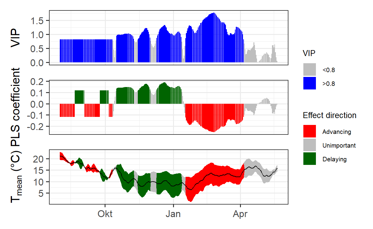
The results provide a much clearer picture compared to the previous analysis in the chapter on Delineating temperature response phases with PLS regression for this location.
Next, the same analysis will be conducted using agroclimatic metrics, specifically Chill Portions and Growing Degree Hours, to further explore temperature influences on phenology.
temps_hourly <- stack_hourly_temps(weather_data,
                                   latitude = 50.6)

daychill <- daily_chill(hourtemps = temps_hourly,
                        running_mean = 1,
                        models = list(Chilling_Hours = Chilling_Hours,
                                      Utah_Chill_Units = Utah_Model,
                                      Chill_Portions = Dynamic_Model,
                                      GDH = GDH)
    )

plscf <- PLS_chill_force(daily_chill_obj = daychill,
                         bio_data_frame = pheno_data[!is.na(pheno_data$pheno), ],
                         split_month = 6,
                         chill_models = "Chill_Portions",
                         heat_models = "GDH",
                         runn_means = 11)

plot_PLS_chill_force(plscf,
                     chill_metric = "Chill_Portions",
                     heat_metric = "GDH",
                     chill_label = "CP",
                     heat_label = "GDH",
                     chill_phase = c(-76,
                                     10),
                     heat_phase = c(17,
                                    97.5))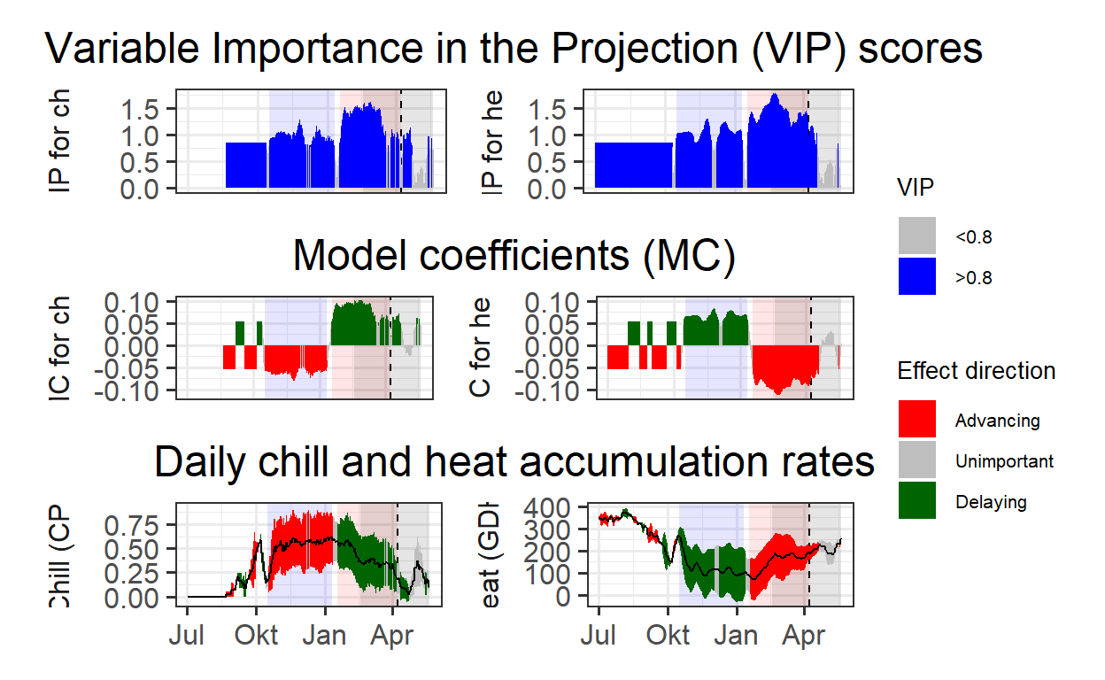
The results now clearly define the chilling and forcing phases, allowing for the calculation of mean chill and heat accumulation, which approximate their respective requirements.
To account for anomalies in some treatments that led to unusual bloom predictions, the median rather than the mean is used for chill and heat accumulation. Additionally, the 25% and 75% quantiles of the distributions serve as an estimate of uncertainty.
chill_phase <- c(290,
                 10)
heat_phase <- c(17,
                97.5)

chill <- tempResponse(hourtemps = temps_hourly,
                      Start_JDay = chill_phase[1],
                      End_JDay = chill_phase[2],
                      models = list(Chill_Portions = Dynamic_Model),
                      misstolerance = 10)

heat <- tempResponse(hourtemps = temps_hourly,
                     Start_JDay = heat_phase[1],
                     End_JDay = heat_phase[2],
                     models = list(GDH = GDH))
chill_requirement <- median(chill$Chill_Portions)
chill_req_error <- quantile(chill$Chill_Portions,
                            c(0.25,
                              0.75))

heat_requirement <- median(heat$GDH)
heat_req_error <- quantile(heat$GDH,
                           c(0.25,
                             0.75))
The estimated chilling requirement for this cultivar is approximately 48.2 Chill Portions (CP), with a 50% confidence interval ranging from 34.4 to 59 CP. The heat requirement is estimated at 11.709 Growing Degree Hours (GDH), with a 50% confidence interval between 6.615 and 16.387 GDH.
Next, the temperature range at this location will be examined in relation to the temperature sensitivity of the Dynamic Model to better understand its impact on chill accumulation.
Chill_sensitivity_temps(Model_sensitivities_CKA,
                        weather_data,
                        temp_model = "Dynamic_Model",
                        month_range = c(10, 11, 12, 1, 2, 3),
                        legend_label = "Chill per day \n(Chill Portions)") +
  ggtitle("Chill model sensitivity at Klein-Altendorf on steroids")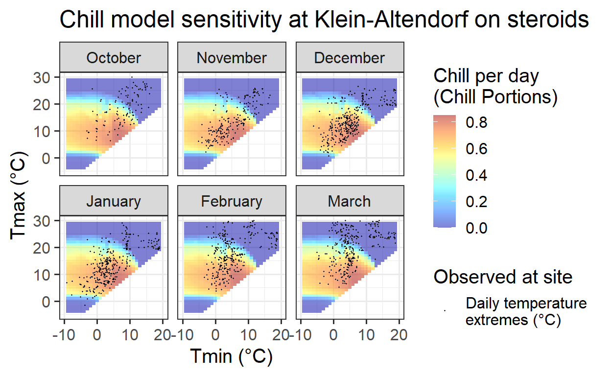
This pattern appears more promising, as the temperature data covers a broad range of model variation. This suggests that the PLS analysis may provide a better representation of dormancy dynamics compared to the naturally observed dataset from Klein-Altendorf.
Next, the temperature response plot will be examined to determine if a clear pattern emerges.
pheno_trend_ggplot(temps = weather_data,
                   pheno = pheno_data[ ,c("Year",
                                          "pheno")],
                   chill_phase = chill_phase,
                   heat_phase = heat_phase,
                   exclude_years = pheno_data$Year[is.na(pheno_data$pheno)],
                   phenology_stage = "Bloom")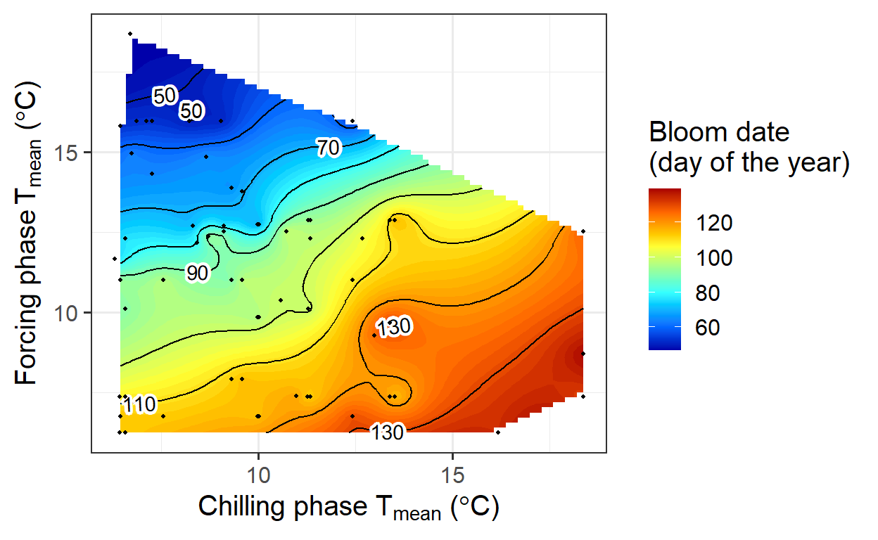
A relatively clear temperature response pattern for Klein-Altendorf is now visible. However, some data points deviate from expected trends. This may be due to certain treatments that introduced temperature conditions far from typical orchard environments. These unusual temperature curves likely contributed to the observed irregularities in the pattern.