The calculation of Chilling Hours requires hourly temperature data. However, since only daily minimum and maximum temperatures are often available, methods for hourly interpolation must be developed. Previous approaches used linear interpolation and triangular temperature profiles (Baldocchi & Wong, 2008):
However, triangular temperature profiles are not always realistic, as temperature increases and decreases are asymmetric.
Idealized Daily Temperature Model
Dale E. Linvill (1990) developed a model that describes daytime warming with a sine curve and nighttime cooling with a logarithmic function. The chillR function daylength() uses astronomical calculations to determine the length of daylight:
Days <- daylength(latitude = 50.4, JDay = 1:365)
Days_df <-
  data.frame(
    JDay = 1:365,
    Sunrise = Days$Sunrise,
    Sunset = Days$Sunset,
    Daylength = Days$Daylength
  )
Days_df <- pivot_longer(Days_df, cols = c(Sunrise:Daylength))

ggplot(Days_df, aes(JDay, value)) +
  geom_line(lwd = 1.5) +
  facet_grid(cols = vars(name)) +
  ylab("Time of Day / Daylength (Hours)") +
  theme_bw(base_size = 15)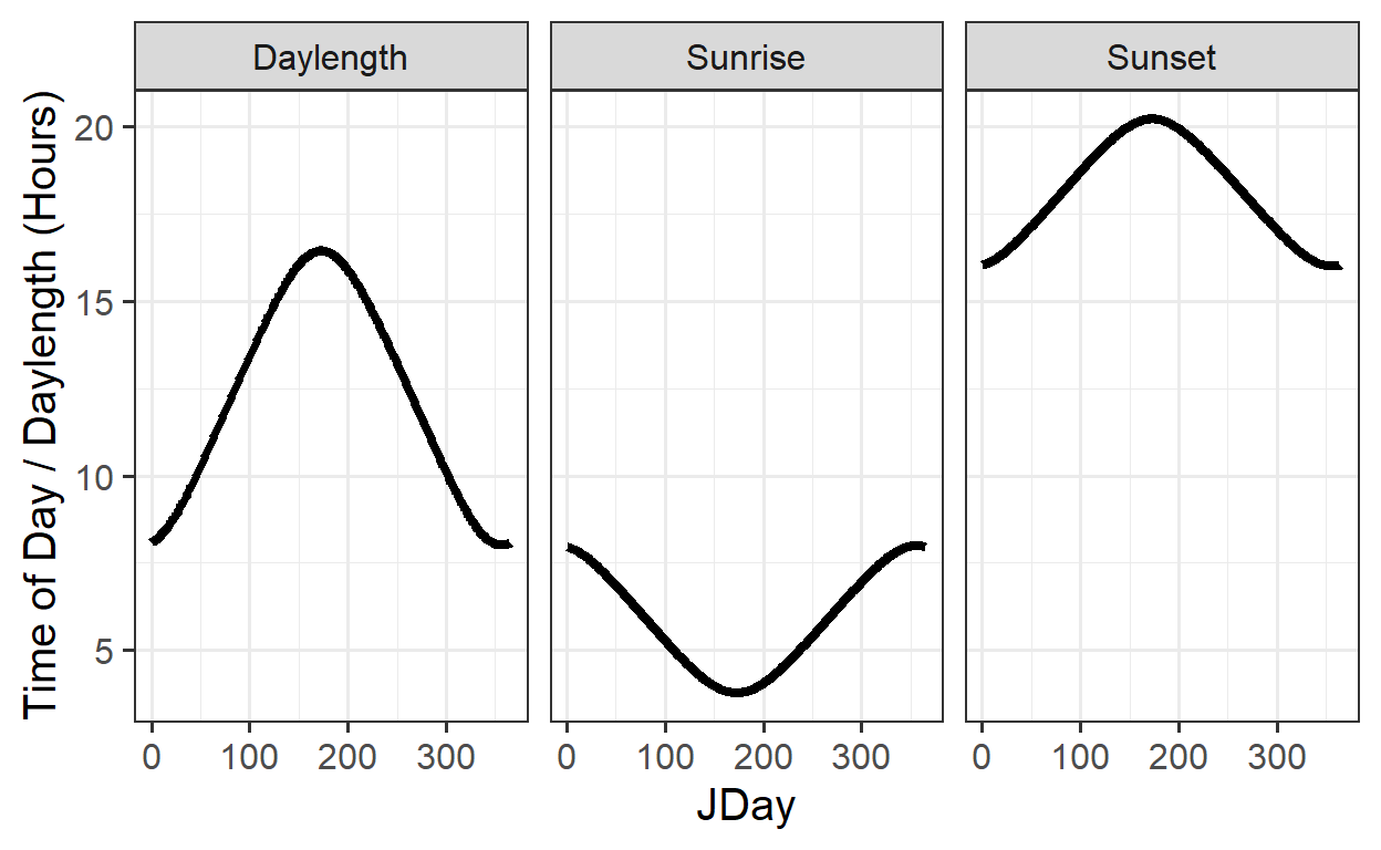
The stack_hourly_temps() function calculates hourly temperatures based on daily Tmin/Tmax values and latitude:
| Year | Month | Day | Tmax | Tmin |
|---|---|---|---|---|
| 1998 | 1 | 1 | 8.2 | 5.1 |
| 1998 | 1 | 2 | 9.1 | 5.0 |
| 1998 | 1 | 3 | 10.4 | 3.3 |
| 1998 | 1 | 4 | 8.4 | 4.5 |
| 1998 | 1 | 5 | 7.7 | 4.5 |
| 1998 | 1 | 6 | 8.1 | 4.4 |
| 1998 | 1 | 7 | 12.0 | 6.9 |
| 1998 | 1 | 8 | 11.2 | 8.6 |
| 1998 | 1 | 9 | 13.9 | 8.5 |
| 1998 | 1 | 10 | 14.5 | 3.6 |
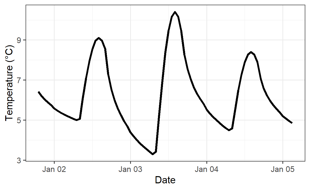
And the following process describes how hourly temperatures can be calculated based on the idealized daily temperature curve:
stack_hourly_temps(KA_weather, latitude = 50.4)| Year | Month | Day | Tmax | Tmin | JDay | Hour | Temp |
|---|---|---|---|---|---|---|---|
| 1998 | 1 | 5 | 7.7 | 4.5 | 5 | 3 | 4.844164 |
| 1998 | 1 | 5 | 7.7 | 4.5 | 5 | 4 | 4.746566 |
| 1998 | 1 | 5 | 7.7 | 4.5 | 5 | 5 | 4.656244 |
| 1998 | 1 | 5 | 7.7 | 4.5 | 5 | 6 | 4.572187 |
| 1998 | 1 | 5 | 7.7 | 4.5 | 5 | 7 | 4.493583 |
| 1998 | 1 | 5 | 7.7 | 4.5 | 5 | 8 | 4.569464 |
| 1998 | 1 | 5 | 7.7 | 4.5 | 5 | 9 | 5.384001 |
| 1998 | 1 | 5 | 7.7 | 4.5 | 5 | 10 | 6.139939 |
| 1998 | 1 | 5 | 7.7 | 4.5 | 5 | 11 | 6.787169 |
| 1998 | 1 | 5 | 7.7 | 4.5 | 5 | 12 | 7.282787 |
| 1998 | 1 | 5 | 7.7 | 4.5 | 5 | 13 | 7.593939 |
| 1998 | 1 | 5 | 7.7 | 4.5 | 5 | 14 | 7.700000 |
| 1998 | 1 | 5 | 7.7 | 4.5 | 5 | 15 | 7.593939 |
| 1998 | 1 | 5 | 7.7 | 4.5 | 5 | 16 | 7.282787 |
| 1998 | 1 | 5 | 7.7 | 4.5 | 5 | 17 | 6.591821 |
| 1998 | 1 | 5 | 7.7 | 4.5 | 5 | 18 | 6.168074 |
| 1998 | 1 | 5 | 7.7 | 4.5 | 5 | 19 | 5.870570 |
| 1998 | 1 | 5 | 7.7 | 4.5 | 5 | 20 | 5.641106 |
| 1998 | 1 | 5 | 7.7 | 4.5 | 5 | 21 | 5.454280 |
| 1998 | 1 | 5 | 7.7 | 4.5 | 5 | 22 | 5.296704 |
| 1998 | 1 | 5 | 7.7 | 4.5 | 5 | 23 | 5.160445 |
Based on this the following plot shows the calculated data:
Empirical Daily Temperature Profiles
In complex topographies (e.g., Oman), idealized models can be inaccurate. Here, the Empirical_daily_temperature_curve() function helps to empirically determine typical hourly temperature patterns:
empi_curve <- Empirical_daily_temperature_curve(Winters_hours_gaps)| Month | Hour | Prediction_coefficient |
|---|---|---|
| 3 | 0 | 0.1774859 |
| 3 | 1 | 0.1550693 |
| 3 | 2 | 0.1285651 |
| 3 | 3 | 0.1145597 |
| 3 | 4 | 0.0696064 |
| 3 | 5 | 0.0339583 |
| 3 | 6 | 0.0000000 |
| 3 | 7 | 0.0313115 |
| 3 | 8 | 0.3121959 |
| 3 | 9 | 0.4953232 |
| 3 | 10 | 0.6819674 |
| 3 | 11 | 0.8227423 |
| 3 | 12 | 0.9506491 |
| 3 | 13 | 0.9662604 |
| 3 | 14 | 0.9915996 |
| 3 | 15 | 1.0000000 |
| 3 | 16 | 0.9490319 |
| 3 | 17 | 0.8483098 |
| 3 | 18 | 0.6864529 |
| 3 | 19 | 0.4945415 |
| 3 | 20 | 0.3636642 |
| 3 | 21 | 0.2972377 |
| 3 | 22 | 0.2360349 |
| 3 | 23 | 0.1794802 |
| 4 | 0 | 0.1960789 |
| 4 | 1 | 0.1407018 |
| 4 | 2 | 0.1283250 |
| 4 | 3 | 0.0819307 |
| 4 | 4 | 0.0541415 |
| 4 | 5 | 0.0188241 |
| 4 | 6 | 0.0000000 |
| 4 | 7 | 0.1697052 |
| 4 | 8 | 0.4442722 |
| 4 | 9 | 0.5939797 |
| 4 | 10 | 0.7363923 |
| 4 | 11 | 0.8399804 |
| 4 | 12 | 0.9245702 |
| 4 | 13 | 0.9770693 |
| 4 | 14 | 0.9963131 |
| 4 | 15 | 1.0000000 |
| 4 | 16 | 0.9568107 |
| 4 | 17 | 0.8698369 |
| 4 | 18 | 0.7343896 |
| 4 | 19 | 0.5330597 |
| 4 | 20 | 0.3941038 |
| 4 | 21 | 0.3186075 |
| 4 | 22 | 0.2594569 |
| 4 | 23 | 0.2114486 |
ggplot(data = empi_curve[1:96, ], aes(Hour, Prediction_coefficient)) +
  geom_line(lwd = 1.3,
            col = "red") +
  facet_grid(rows = vars(Month)) +
  xlab("Hour of the day") +
  ylab("Prediction coefficient") +
  theme_bw(base_size = 15)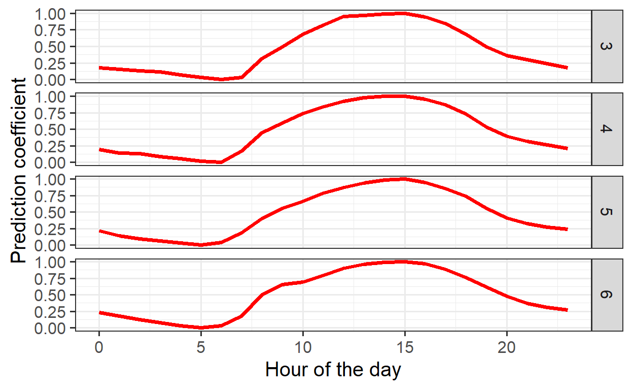
The function Empirical_hourly_temperatures() uses these coefficients to generate hourly temperatures. To fill gaps in daily or hourly temperature records, the make_all_day_table() function is used.
coeffs <- Empirical_daily_temperature_curve(Winters_hours_gaps)
Winters_daily <-
  make_all_day_table(Winters_hours_gaps, input_timestep = "hour")
Winters_hours <- Empirical_hourly_temperatures(Winters_daily, coeffs)
The next step is to plot the results to visualize the hourly temperature data. This enables a comparison between the empirical method, the triangular function, and the idealized temperature curve. Furthermore, actual observed temperatures will be used for validation. To streamline this process, the data will first be simplified for easier handling:
Winters_hours <- Winters_hours[, c("Year", "Month", "Day", "Hour", "Temp")]
colnames(Winters_hours)[ncol(Winters_hours)] <- "Temp_empirical"
Winters_ideal <-
  stack_hourly_temps(Winters_daily, latitude = 38.5)$hourtemps
Winters_ideal <- Winters_ideal[, c("Year", "Month", "Day", "Hour", "Temp")]
colnames(Winters_ideal)[ncol(Winters_ideal)] <- "Temp_ideal"
The next step is to generate the triangular dataset, requiring a clear understanding of its construction.
Winters_triangle <- Winters_daily
Winters_triangle[, "Hour"] <- 0
Winters_triangle$Hour[nrow(Winters_triangle)] <- 23
Winters_triangle[, "Temp"] <- 0
Winters_triangle <-
  make_all_day_table(Winters_triangle, timestep = "hour")
colnames(Winters_triangle)[ncol(Winters_triangle)] <-
  "Temp_triangular"

# with the following loop, we fill in the daily Tmin and Tmax values for every
# hour of the dataset

for (i in 2:nrow(Winters_triangle))
{
  if (is.na(Winters_triangle$Tmin[i]))
    Winters_triangle$Tmin[i] <- Winters_triangle$Tmin[i - 1]
  if (is.na(Winters_triangle$Tmax[i]))
    Winters_triangle$Tmax[i] <- Winters_triangle$Tmax[i - 1]
}
Winters_triangle$Temp_triangular <- NA

# now we assign the daily Tmin value to the 6th hour of every day

Winters_triangle$Temp_triangular[which(Winters_triangle$Hour == 6)] <-
  Winters_triangle$Tmin[which(Winters_triangle$Hour == 6)]

# we also assign the daily Tmax value to the 18th hour of every day

Winters_triangle$Temp_triangular[which(Winters_triangle$Hour == 18)] <-
  Winters_triangle$Tmax[which(Winters_triangle$Hour == 18)]

# in the following step, we use the chillR function "interpolate_gaps"
# to fill in all the gaps in the hourly record with straight lines

Winters_triangle$Temp_triangular <-
  interpolate_gaps(Winters_triangle$Temp_triangular)$interp
Winters_triangle <-
  Winters_triangle[, c("Year", "Month", "Day", "Hour", "Temp_triangular")]
Comparison of Temperature Models
Three methods were compared: the triangular model, the idealized model, and the empirical model. The data were merged and visualized:
Accuracy of the three models was then compared using the Root Mean Square Error (RMSE) metric:
RMSEP(Winters_temps$Temp_triangular, Winters_temps$Temp)[1] 4.695289RMSEP(Winters_temps$Temp_ideal, Winters_temps$Temp)[1] 1.630714RMSEP(Winters_temps$Temp_empirical, Winters_temps$Temp)[1] 1.410625Results:
- Triangular method: RMSE = 4.7
- Idealized model: RMSE = 1.63
- Empirical model: RMSE = 1.41
The empirical model achieves the highest accuracy. This approach is especially crucial for calculating the Chilling Hours.
Exercises on hourly temperatures
- Choose a location of interest, find out its latitude and produce plots of daily sunrise, sunset and daylength.
The Yakima Valley in Washington State, USA, is located at about 46.6° N latitude. This region has a continental climate with cold winters and hot, dry summers, creating ideal conditions for growing fruit trees. The valley is well known for producing a variety of fruits, including apples, cherries, pears, and grapes, which benefit from its distinct seasonal changes. Using the daylength() function, you could create plots showing daily sunrise, sunset, and day length times.
Yakima <- daylength(latitude = 46.6, JDay = 1:365)

Yakima_df <-
  data.frame(
    JDay = 1:365,
    Sunrise = Yakima$Sunrise,
    Sunset = Yakima$Sunset,
    Daylength = Yakima$Daylength
  )

Yakima_df_longer <- pivot_longer(Yakima_df, cols = c(Sunrise:Daylength))

ggplot(Yakima_df_longer, aes(JDay, value)) +
  geom_line(lwd = 1.5) +
  facet_grid(cols = vars(name)) +
  ylab("Time of Day / Daylength (Hours)") +
  theme_bw(base_size = 15)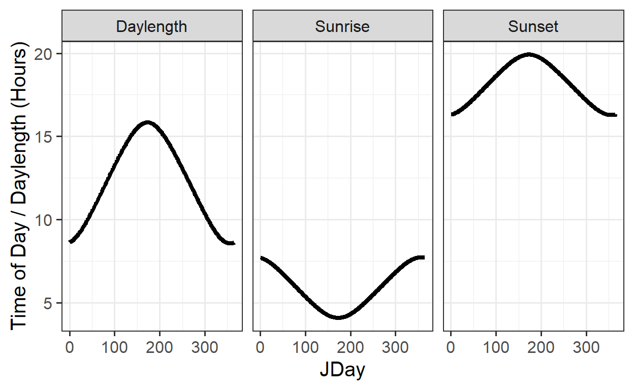
- Produce an hourly dataset, based on idealized daily curves, for the
KA_weatherdataset (included inchillR)
KA_hourly <- stack_hourly_temps(KA_weather, latitude = 50.4)Based on idealized daily curves, the hourly dataset for Julian Day 6 (January 6th) is shown below:
| Year | Month | Day | Tmax | Tmin | JDay | Hour | Temp |
|---|---|---|---|---|---|---|---|
| 1998 | 1 | 6 | 8.1 | 4.4 | 6 | 0 | 4.990741 |
| 1998 | 1 | 6 | 8.1 | 4.4 | 6 | 1 | 4.881232 |
| 1998 | 1 | 6 | 8.1 | 4.4 | 6 | 2 | 4.782253 |
| 1998 | 1 | 6 | 8.1 | 4.4 | 6 | 3 | 4.691956 |
| 1998 | 1 | 6 | 8.1 | 4.4 | 6 | 4 | 4.608939 |
| 1998 | 1 | 6 | 8.1 | 4.4 | 6 | 5 | 4.532117 |
| 1998 | 1 | 6 | 8.1 | 4.4 | 6 | 6 | 4.460628 |
| 1998 | 1 | 6 | 8.1 | 4.4 | 6 | 7 | 4.393780 |
| 1998 | 1 | 6 | 8.1 | 4.4 | 6 | 8 | 4.491337 |
| 1998 | 1 | 6 | 8.1 | 4.4 | 6 | 9 | 5.430950 |
| 1998 | 1 | 6 | 8.1 | 4.4 | 6 | 10 | 6.302486 |
| 1998 | 1 | 6 | 8.1 | 4.4 | 6 | 11 | 7.048391 |
| 1998 | 1 | 6 | 8.1 | 4.4 | 6 | 12 | 7.619410 |
| 1998 | 1 | 6 | 8.1 | 4.4 | 6 | 13 | 7.977836 |
| 1998 | 1 | 6 | 8.1 | 4.4 | 6 | 14 | 8.100000 |
| 1998 | 1 | 6 | 8.1 | 4.4 | 6 | 15 | 7.977836 |
| 1998 | 1 | 6 | 8.1 | 4.4 | 6 | 16 | 7.619410 |
| 1998 | 1 | 6 | 8.1 | 4.4 | 6 | 17 | 7.419674 |
| 1998 | 1 | 6 | 8.1 | 4.4 | 6 | 18 | 7.318918 |
| 1998 | 1 | 6 | 8.1 | 4.4 | 6 | 19 | 7.248287 |
| 1998 | 1 | 6 | 8.1 | 4.4 | 6 | 20 | 7.193854 |
| 1998 | 1 | 6 | 8.1 | 4.4 | 6 | 21 | 7.149557 |
| 1998 | 1 | 6 | 8.1 | 4.4 | 6 | 22 | 7.112208 |
| 1998 | 1 | 6 | 8.1 | 4.4 | 6 | 23 | 7.079920 |
- Produce empirical temperature curve parameters for the
Winters_hours_gapsdataset, and use them to predict hourly values from daily temperatures (this is very similar to the example above, but please make sure you understand what’s going on).
# Generating empirical daily temperature curve from observed hourly data
empi_curve <- Empirical_daily_temperature_curve(Winters_hours_gaps)

# Filling gaps in daily or hourly temperature data
Winters_daily <- make_all_day_table(Winters_hours_gaps, input_timestep = "hour")

# Using empirical coefficients to predict hourly temperatures based on daily temperatures
Winters_hours <- Empirical_hourly_temperatures(Winters_daily, empi_curve)

# Make an empirical dataset
Winters_hours <- Winters_hours[, c("Year", "Month", "Day", "Hour", "Temp")]
colnames(Winters_hours)[ncol(Winters_hours)] <- "Temp_empirical"

# Merge data frames
Winters_temps <-
  merge(Winters_hours_gaps,
        Winters_hours,
        by = c("Year", "Month", "Day", "Hour"))
# Covert Year, Month, Day and Hour columns into R's date formate and reorganizing the data frame
Winters_temps[, "DATE"] <-
ISOdate(Winters_temps$Year,
Winters_temps$Month,
Winters_temps$Day,
Winters_temps$Hour)
Winters_temps_to_plot <-
Winters_temps[, c("DATE",
"Temp",
"Temp_empirical")]
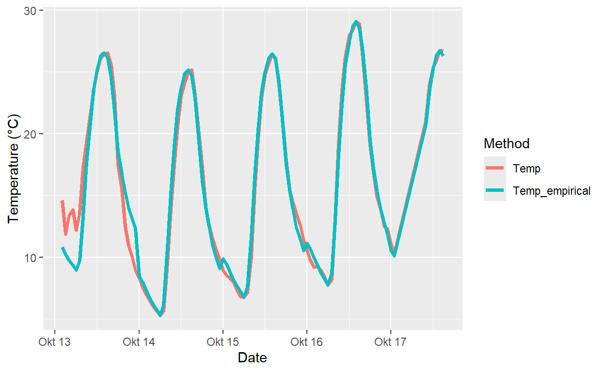
Winters_temps_to_plot <- Winters_temps_to_plot[100:200, ]
Winters_temps_to_plot <- pivot_longer(Winters_temps_to_plot, cols=Temp:Temp_empirical)
colnames(Winters_temps_to_plot) <- c("DATE", "Method", "Temperature")
ggplot(data = Winters_temps_to_plot, aes(DATE, Temperature, colour = Method)) +
geom_line(lwd = 1.3) + ylab("Temperature (°C)") + xlab("Date")