Effective orchard management requires understanding local climate conditions, especially chill availability, to make informed decisions on tree species and cultivars. While historical weather data has been useful, orchard managers now need more tailored, site-specific forecasts, especially regarding chill and heat levels, to optimize planting decisions.
Chill Scenarios
The key objective is to provide growers with reliable forecasts for chill availability, helping them select the right trees. Climate conditions like chill and heat accumulation must be predicted over the long term, beyond simple historical data. This enables better decision-making when considering tree species that will meet their specific climatic needs and cope with potential frost risks.
Risk Assessment in Orchard Planning
Because trees have long lifespans, they experience different weather patterns throughout their productive years. For optimal yields, trees must consistently meet their climatic requirements each year. Orchard managers need to understand the full range of possible weather scenarios, ensuring that chosen trees will meet their chill requirements and avoid frost damage. This requires assessing the distribution of local climate data, as opposed to relying on a single year’s data.
Weather Generators
The best way to assess the local climate is through long-term weather data. Weather generators model these patterns and simulate realistic weather conditions to help in orchard planning. chillR uses the R-compatible weather generator RMAWGEN for simulating temperature data, which is crucial for modeling chill availability.
Weather Generation in chillR
To generate temperature data, chillR uses the RMAWGEN weather generator. The function temperature_generation is used to calibrate long-term temperature data, and it produces simulated temperature records that can be used to evaluate climate patterns over extended periods.
Temp <- KA_weather %>%
  temperature_generation(years = c(1998, 2009),
                         sim_years = c(2001, 2100))

Temperatures <- KA_weather %>% filter(Year %in% 1998:2009) %>%
  cbind(Data_source = "observed") %>%
  rbind(
    Temp[[1]] %>% select(c(Year,
                           Month,
                           Day,
                           Tmin,
                           Tmax)) %>%
      cbind(Data_source = "simulated")
  ) %>%
  mutate(Date = as.Date(ISOdate(2000,
                                Month,
                                Day)))
Temperature Visualization
To compare observed and simulated temperature data, ggplot2 is used to visualize smoothed temperature trends, allowing for clearer analysis of temperature patterns.
ggplot(data = Temperatures,
       aes(Date, Tmin)) +
  geom_smooth(aes(colour = factor(Year))) +
  facet_wrap(vars(Data_source)) +
  theme_bw(base_size = 20) +
  theme(legend.position = "none") +
  scale_x_date(date_labels = "%b")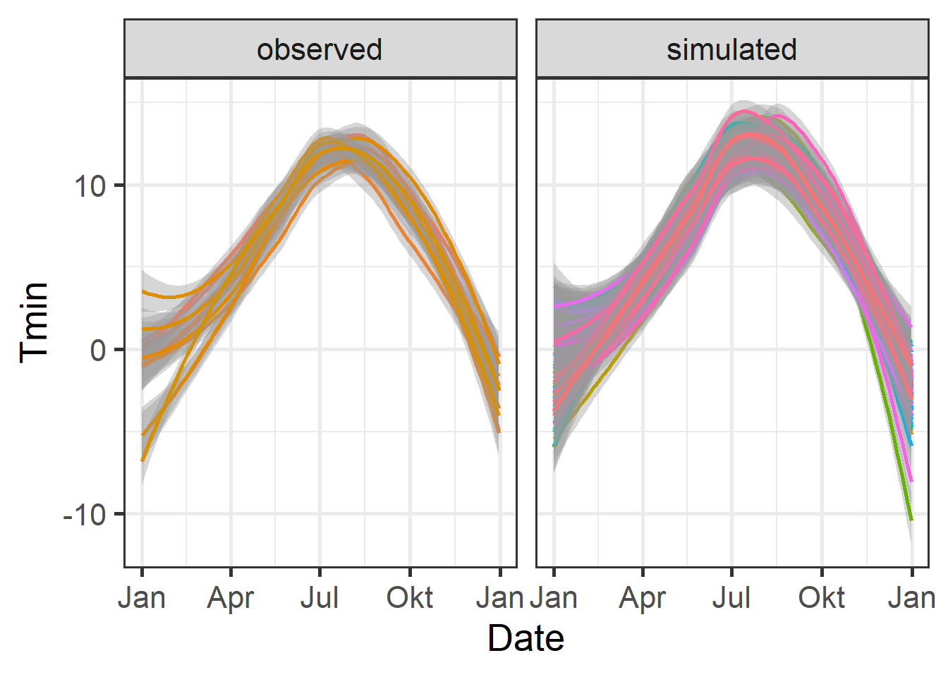
ggplot(data=Temperatures,
       aes(Date, Tmax)) +
  geom_smooth(aes(colour = factor(Year))) +
  facet_wrap(vars(Data_source)) +
  theme_bw(base_size = 20) +
  theme(legend.position = "none") +
  scale_x_date(date_labels = "%b")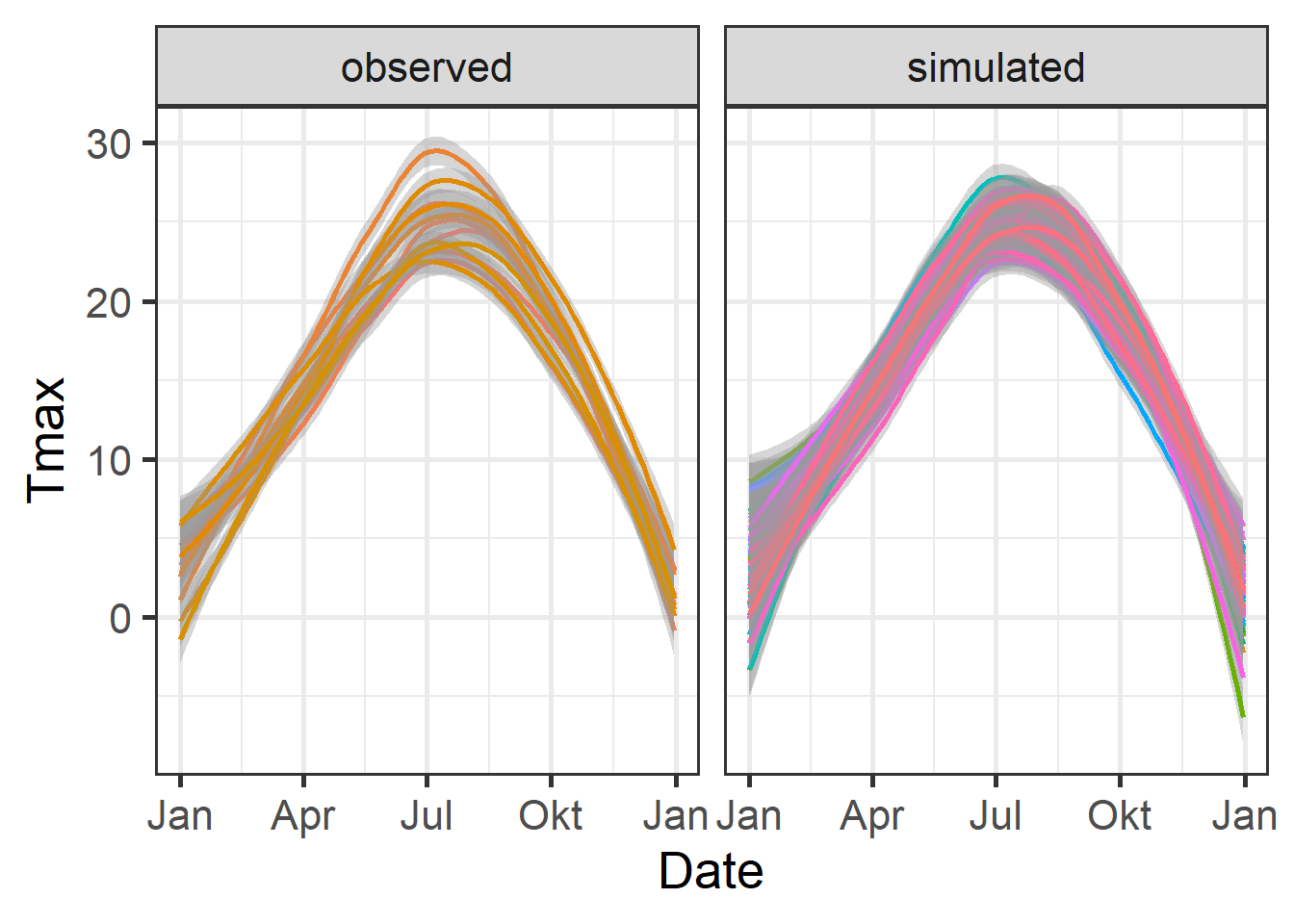
Chill Comparison
Next, chill accumulation is analyzed by comparing observed and simulated chill data using the stack_hourly_temps and chilling functions. This helps in assessing the chill accumulation over multiple years.
chill_observed <- Temperatures %>%
  filter(Data_source == "observed") %>%
  stack_hourly_temps(latitude = 50.4) %>%
  chilling(Start_JDay = 305,
           End_JDay = 59)

chill_simulated <- Temperatures %>%
  filter(Data_source == "simulated") %>%
  stack_hourly_temps(latitude = 50.4) %>%
  chilling(Start_JDay = 305,
           End_JDay = 59)

chill_comparison <-
  cbind(chill_observed,
        Data_source = "observed") %>%
  rbind(cbind(chill_simulated,
              Data_source = "simulated"))
Chill Distribution Visualization
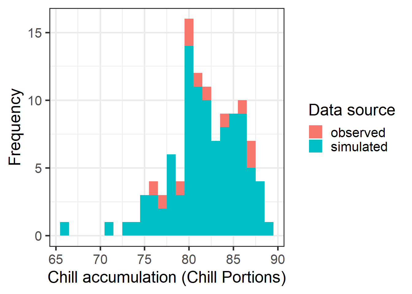
The distribution of chill accumulation is visualized using a histogram to compare observed and simulated chill portions.
Cumulative Distribution Function
A cumulative distribution function (CDF) is plotted to visualize the likelihood of meeting the required chill accumulation thresholds.
chill_simulations <-
chill_comparison_full_seasons %>%
filter(Data_source == "simulated")
ggplot(chill_simulations,
aes(x = Chill_portions)) +
stat_ecdf(geom = "step",
lwd = 1.5,
col = "blue") +
ylab("Cumulative probability") +
xlab("Chill accumulation (in Chill Portions)") +
theme_bw(base_size = 20)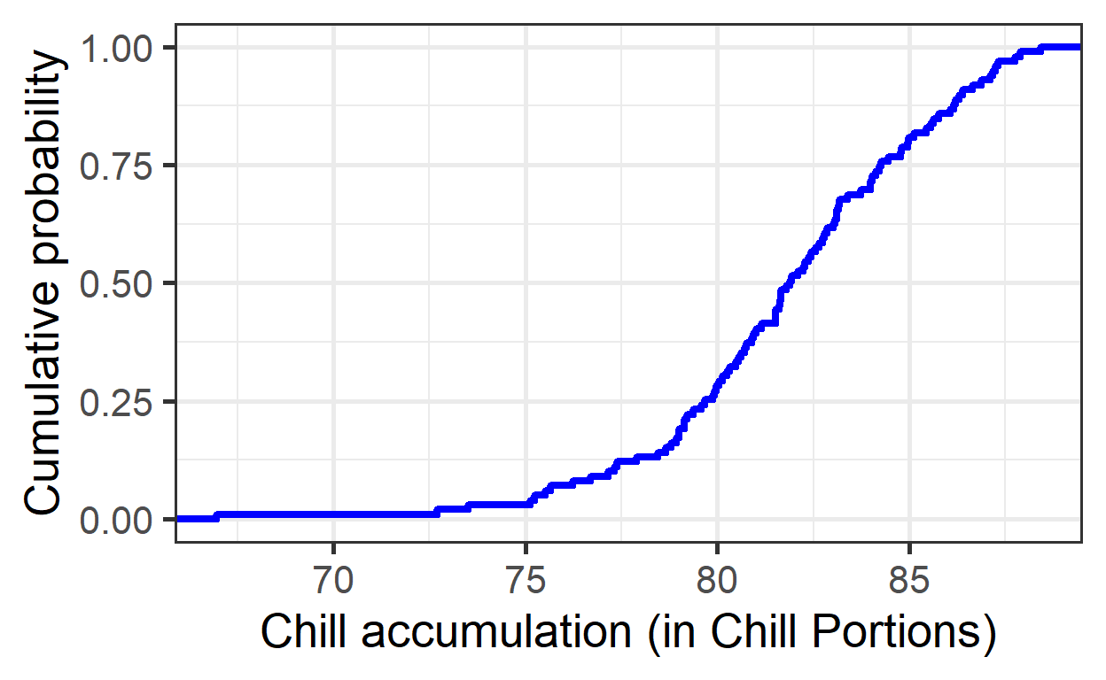
Quantiles for Safe Winter Chill
Specific quantiles of chill accumulation are calculated to assess “Safe Winter Chill” levels and the risk associated with not meeting chilling requirements.
# 10% quantile (Safe Winter Chill)
quantile(chill_simulations$Chill_portions, 0.1) 10%
77.28649 # 50% confidence interval (25th to 75th percentile)
quantile(chill_simulations$Chill_portions, c(0.25, 0.75)) 25% 75%
79.76791 84.23847 Exercises on temperature generation
- For the location you chose for your earlier analyses, use chillR’s weather generator to produce 100 years of synthetic temperature data.
# Generate temperature data with temperature_generation function
Temp <- Yakima %>%
temperature_generation(years = c(1998, 2009),
sim_years = c(2001, 2100))
Temperatures <- Yakima %>%
select(Year, Month, Day, Tmin, Tmax) %>%
filter(Year %in% 1998:2009) %>%
cbind(Data_source = "observed") %>%
rbind(
Temp[[1]] %>% select(c(Year, Month, Day, Tmin, Tmax)) %>%
cbind(Data_source = "simulated")
) %>%
mutate(Date = as.Date(ISOdate(2000, Month, Day)))# Plot observed vs. simulated minimum temperature data
ggplot(data = Temperatures,
aes(Date,
Tmin)) +
geom_smooth(aes(colour = factor(Year))) +
facet_wrap(vars(Data_source)) +
theme_bw(base_size = 20) +
theme(legend.position = "none") +
scale_x_date(date_labels = "%b")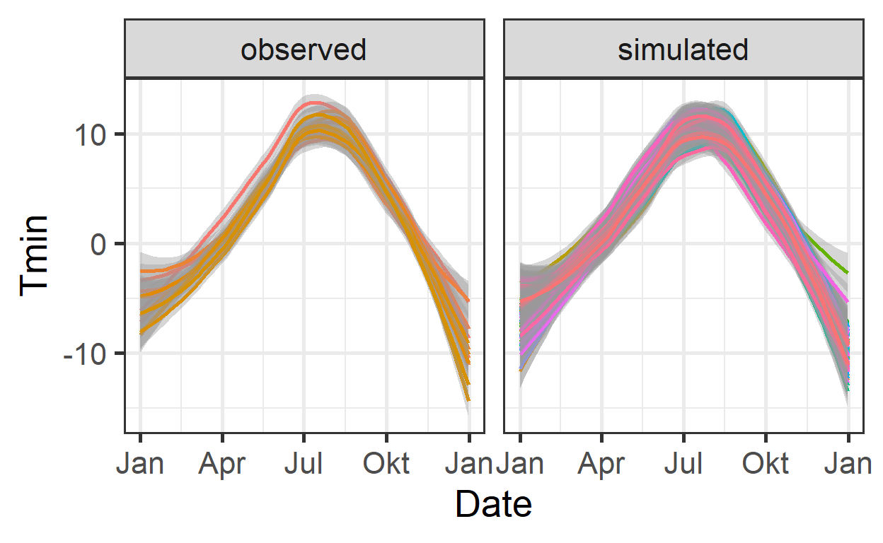
# Plot observed vs. simulated maximum temperature data
ggplot(data = Temperatures,
aes(Date,
Tmax)) +
geom_smooth(aes(colour = factor(Year))) +
facet_wrap(vars(Data_source)) +
theme_bw(base_size = 20) +
theme(legend.position = "none") +
scale_x_date(date_labels = "%b")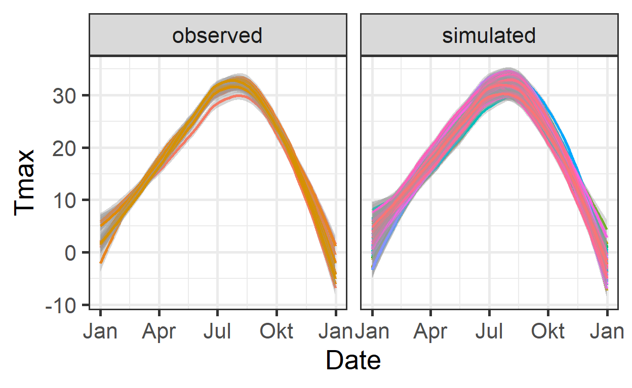
- Calculate winter chill (in Chill Portions) for your synthetic weather, and illustrate your results as histograms and cumulative distributions.
# Analyzing chill accumulation by comparing observed and simulated chill data using the stack_hourly_temps function
chill_observed <- Temperatures %>%
filter(Data_source == "observed") %>%
stack_hourly_temps(latitude = 46.6) %>%
chilling(Start_JDay = 305,
End_JDay = 59)
chill_simulated <- Temperatures %>%
filter(Data_source == "simulated") %>%
stack_hourly_temps(latitude = 46.6) %>%
chilling(Start_JDay = 305,
End_JDay = 59)
chill_comparison <-
cbind(chill_observed,
Data_source = "observed") %>%
rbind(cbind(chill_simulated,
Data_source = "simulated"))
chill_comparison_full_seasons <-
chill_comparison %>%
filter(Perc_complete == 100)# Plot chill distribution as histogram
ggplot(chill_comparison_full_seasons,
       aes(x = Chill_portions)) +
  geom_histogram(binwidth = 1,
                 aes(fill = factor(Data_source))) +
  theme_bw(base_size = 20) +
  labs(fill = "Data source") +
  xlab("Chill accumulation (Chill Portions)") +
  ylab("Frequency")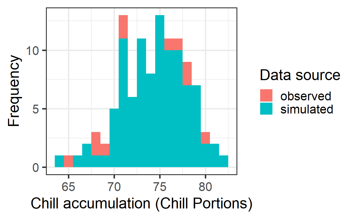
chill_simulations <-
  chill_comparison_full_seasons %>%
  filter(Data_source == "simulated")

# Plot chill distribution as cumulative distribution
ggplot(chill_simulations,
       aes(x = Chill_portions)) +
  stat_ecdf(geom = "step",
            lwd = 1.5,
            col = "blue") +
  ylab("Cumulative probability") +
  xlab("Chill accumulation (in Chill Portions)") +
  theme_bw(base_size = 20)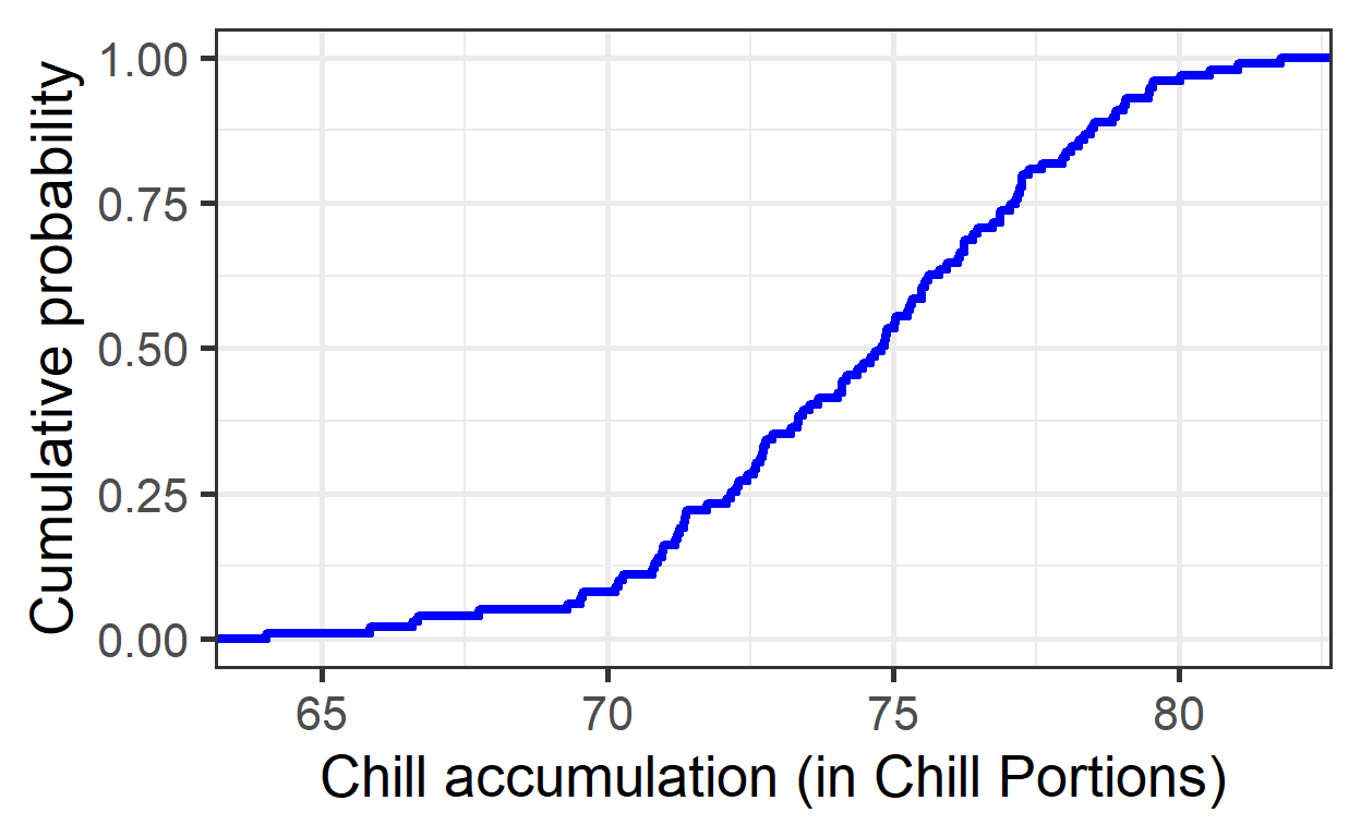
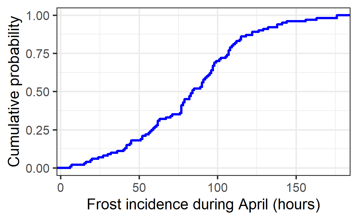
- Produce similar plots for the number of freezing hours (<0°C) in April (or October, if your site is in the Southern Hemisphere) for your location of interest
df <- data.frame(
  lower =  c(-1000,    0),
  upper =  c(    0, 1000),
  weight = c(    1,    0))

freezing_hours <- function(x) step_model(x, df)

chill_observed <- Temperatures %>%
  filter(Data_source == "observed") %>%
  stack_hourly_temps(latitude = 46.6) %>%
  tempResponse(Start_JDay = 91,
               End_JDay = 120,
               models = list(Frost = freezing_hours,
                             Chill_portions = Dynamic_Model,
                             GDH = GDH))

chill_simulated <- Temperatures %>%
  filter(Data_source == "simulated") %>%
  stack_hourly_temps(latitude = 46.6) %>%
  tempResponse(Start_JDay = 91,
               End_JDay = 120,
               models=list(Frost = freezing_hours,
                           Chill_portions = Dynamic_Model,
                           GDH = GDH))

chill_comparison <-
  cbind(chill_observed,
        Data_source = "observed") %>%
  rbind(cbind(chill_simulated,
              Data_source = "simulated"))

chill_comparison_full_seasons <-
  chill_comparison %>%
  filter(Perc_complete == 100)
# Plot chill distribution in April as histogram
ggplot(chill_comparison_full_seasons,
aes(x = Frost)) +
geom_histogram(binwidth = 25,
aes(fill = factor(Data_source))) +
theme_bw(base_size = 10) +
labs(fill = "Data source") +
xlab("Frost incidence during April (hours)") +
ylab("Frequency")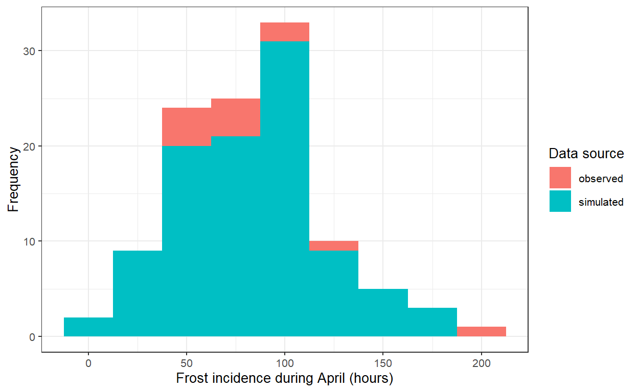
chill_simulations <-
  chill_comparison_full_seasons %>%
  filter(Data_source == "simulated")

# Plot chill distribution in April as cumulative distribution
ggplot(chill_simulations,
       aes(x = Frost)) +
  stat_ecdf(geom = "step",
            lwd = 1.5,
            col = "blue") +
  ylab("Cumulative probability") +
  xlab("Frost incidence during April (hours)") +
  theme_bw(base_size = 20)