In this section the focus shifts to a detailed phenology analysis, using the bloom dates of the pear cultivar ‘Alexander Lucas’ as an example. This dataset was previously examined in the frost analysis and includes a time series (1958–2019) of first, full, and last bloom dates recorded at Campus Klein-Altendorf.
For this analysis, only first bloom dates will be used. If working on a personal computer, the dataset can be downloaded from the provided link.
Data Reading and Preparation
The first step is to load the dataset from a CSV file. The read_tab function is used to handle potential issues with delimiters (such as commas or semicolons).
Alex <- read_tab("data/Alexander_Lucas_bloom_1958_2019.csv")Once the data is loaded, it is prepared for analysis. The pivot_longer function transforms the data from wide to long format so that bloom stages are consolidated into a single column.
Alex <- pivot_longer(Alex,
                     cols = c(First_bloom:Last_bloom),
                     names_to = "Stage",
                     values_to = "YEARMODA")

Alex_first <- Alex %>%
  mutate(Year = as.numeric(substr(YEARMODA, 1, 4)),
         Month = as.numeric(substr(YEARMODA, 5, 6)),
         Day = as.numeric(substr(YEARMODA, 7, 8))) %>%
  make_JDay() %>%
  filter(Stage == "First_bloom")
This process extracts the year, month, and day from the YEARMODA column, converts them into a Julian day (JDay), and filters the data for the first bloom.
Time Series Analysis
The first step in analyzing the phenology is visualizing the first bloom dates over the years to identify any trends or changes over time.
Visualization of First Bloom Dates
A scatter plot is used to visualize the first bloom dates across years:
ggplot(Alex_first,
       aes(Pheno_year,
           JDay)) +
  geom_point() +
  ylab("First bloom date (day of the year)") +
  xlab ("Year") +
  theme_bw(base_size = 15)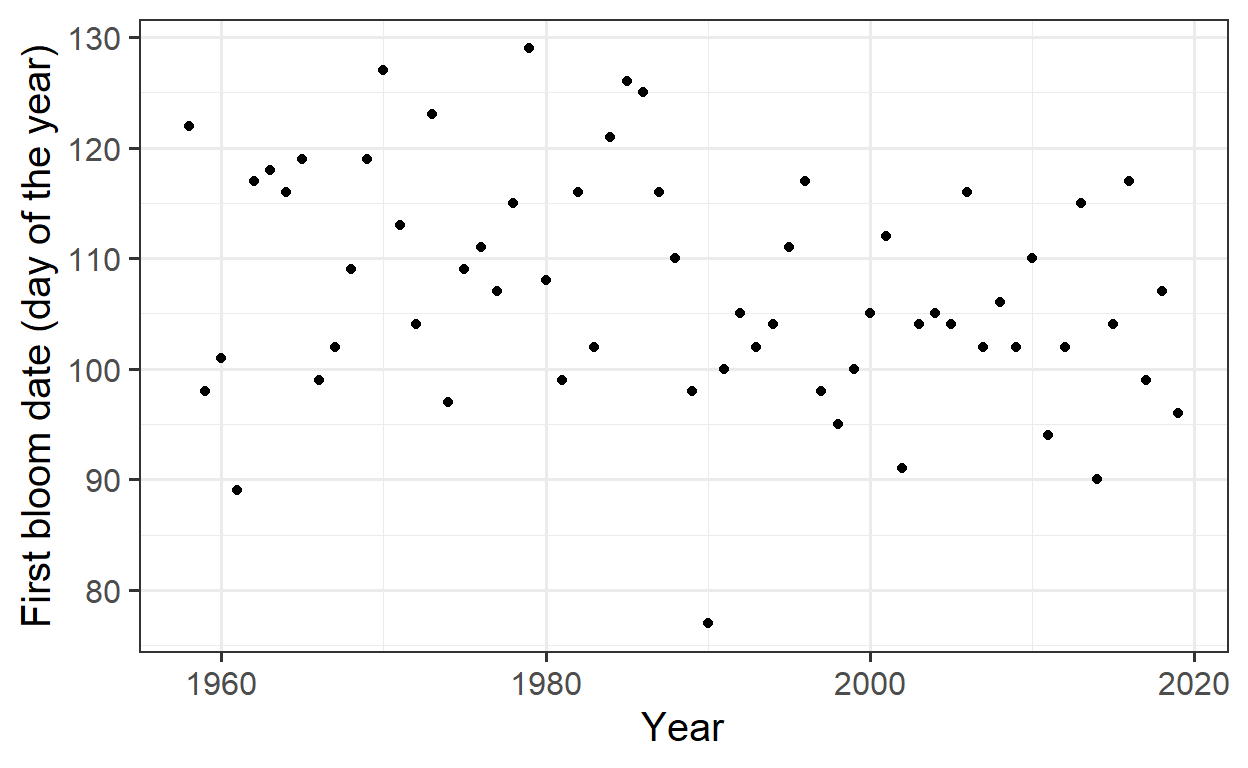
At first glance, the plot does not reveal a clear pattern or trend. To check for any underlying trend, the Kendall trend test is applied to statistically assess the presence of a trend.
Kendall Trend Test
The Kendall test checks whether there is a statistically significant trend in the bloom dates over the years:
tau = -0.186, 2-sided pvalue =0.03533The p-value of 0.035 and the negative Tau value suggest that there is a significant trend toward earlier blooming. This indicates that the bloom dates have been shifting earlier over time.
Linear Regression for Trend Analysis
To quantify the trend, a linear regression is fitted, and the trend is visualized with a regression line:
Call:
lm(formula = y ~ x)

Residuals:
     Min       1Q   Median       3Q      Max
-30.0959  -6.3591  -0.5959   6.6468  20.1238

Coefficients:
             Estimate Std. Error t value Pr(>|t|)
(Intercept) 429.16615  142.06000   3.021   0.0037 **
x            -0.16184    0.07144  -2.266   0.0271 *
---
Signif. codes:  0 '***' 0.001 '**' 0.01 '*' 0.05 '.' 0.1 ' ' 1

Residual standard error: 10.07 on 60 degrees of freedom
Multiple R-squared:  0.0788,    Adjusted R-squared:  0.06345
F-statistic: 5.133 on 1 and 60 DF, p-value: 0.0271ggplot(Alex_first,
aes(Year,
JDay)) +
geom_point() +
geom_smooth(method = 'lm',
formula = y ~ x) +
ylab("First bloom date (day of the year)") +
xlab ("Year") +
theme_bw(base_size = 15)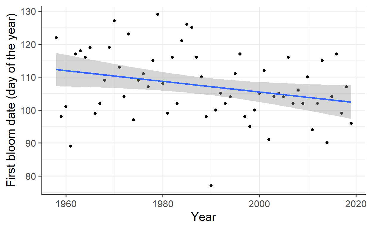
The estimated slope of -0.16 indicates that, on average, the bloom dates are occurring 0.16 days earlier each year.
Polynomial Regression for a Complex Model
A linear regression is a simple approach, but in many cases, a more complex model might be necessary. Here, a 25th-degree polynomial is used to improve the model fit.
Call:
lm(formula = y ~ poly(x, 25))

Residuals:
     Min       1Q   Median       3Q      Max
-13.7311  -4.5098  -0.1227   2.8640  15.4590

Coefficients:
              Estimate Std. Error t value             Pr(>|t|)
(Intercept)   107.3387     1.0549 101.753 < 0.0000000000000002 ***
poly(x, 25)1  -22.8054     8.3063  -2.746              0.00937 **
poly(x, 25)2   -5.8672     8.3063  -0.706              0.48451
poly(x, 25)3   14.7725     8.3063   1.778              0.08377 .
poly(x, 25)4   -5.3974     8.3063  -0.650              0.51995
poly(x, 25)5  -11.6801     8.3063  -1.406              0.16825
poly(x, 25)6    2.1928     8.3063   0.264              0.79329
poly(x, 25)7   -0.3034     8.3063  -0.037              0.97107
poly(x, 25)8    6.0115     8.3063   0.724              0.47391
poly(x, 25)9  -22.2895     8.3063  -2.683              0.01094 *
poly(x, 25)10   5.9522     8.3063   0.717              0.47825
poly(x, 25)11  -6.1217     8.3063  -0.737              0.46590
poly(x, 25)12   3.2676     8.3063   0.393              0.69636
poly(x, 25)13 -14.8467     8.3063  -1.787              0.08229 .
poly(x, 25)14  13.5180     8.3063   1.627              0.11237
poly(x, 25)15  10.1544     8.3063   1.222              0.22946
poly(x, 25)16 -12.6116     8.3063  -1.518              0.13767
poly(x, 25)17  -1.3315     8.3063  -0.160              0.87354
poly(x, 25)18  -6.3438     8.3063  -0.764              0.45000
poly(x, 25)19  14.9753     8.3063   1.803              0.07978 .
poly(x, 25)20   3.4573     8.3063   0.416              0.67972
poly(x, 25)21 -29.1997     8.3063  -3.515              0.00121 **
poly(x, 25)22  10.4145     8.3063   1.254              0.21799
poly(x, 25)23   2.9898     8.3063   0.360              0.72100
poly(x, 25)24 -14.3045     8.3063  -1.722              0.09363 .
poly(x, 25)25 -20.9324     8.3063  -2.520              0.01631 *
---
Signif. codes:  0 '***' 0.001 '**' 0.01 '*' 0.05 '.' 0.1 ' ' 1

Residual standard error: 8.306 on 36 degrees of freedom
Multiple R-squared:  0.6237,    Adjusted R-squared:  0.3623
F-statistic: 2.386 on 25 and 36 DF, p-value: 0.008421ggplot(Alex_first,
aes(Year,
JDay)) +
geom_point() +
geom_smooth(method='lm',
formula = y ~ poly(x, 25)) +
ylab("First bloom date (day of the year)") +
xlab ("Year") +
theme_bw(base_size = 15)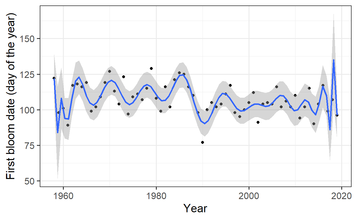
The 25th-degree polynomial fits the data very well, but this is an example of overfitting, where the model becomes too complex and captures random fluctuations in the data instead of real underlying patterns.
Overfitting
An overly complex model that fits the data too well can be problematic because it may capture random noise instead of genuine relationships. While a good model typically has low error, overfitting makes it difficult to generalize the model to new data.
p-Hacking
p-hacking refers to the practice of searching through large datasets to find random correlations and then presenting them as statistically significant. This practice leads to false discoveries and is considered poor scientific practice.
Ecological Theory
To understand phenomena like bloom dates better, it is crucial to consider the underlying ecological processes. A basic ecological theory suggests that temperature affects phenology.
Causal Diagram: Time → Temperature → Phenology
The direct influence of time on phenology might be misleading, as it is not time itself that drives the bloom dates but rather changes in temperature, which are influenced by climate change:
Time → Greenhouse Gas Concentrations → Climate Forcing → Temperature
Temperature Correlations
To better understand the relationship between temperature and bloom dates, weather data is included. Annual average temperatures are calculated:
temperature <- read_tab("data/TMaxTMin1958-2019_patched.csv")

Tmin <- temperature %>%
  group_by(Year) %>%
  summarise(Tmin = mean(Tmin))

Tmax <- temperature %>%
  group_by(Year) %>%
  summarise(Tmax = mean(Tmax))

Annual_means <- Tmin %>%
  cbind(Tmax[,2]) %>%
  mutate(Tmean = (Tmin + Tmax)/2)

Annual_means <- merge(Annual_means,
                      Alex_first)

Annual_means_longer <- Annual_means[,c(1:4,10)] %>%
  pivot_longer(cols = c(Tmin:Tmean),
               names_to = "Variable",
               values_to = "Temp")
These temperature data are then combined with bloom data to create a plot showing the relationship between temperature and first bloom dates.
Visualizing Temperature and Bloom Date
ggplot(Annual_means_longer,
       aes(x=Temp,
           y=JDay)) +
  geom_point() +
  geom_smooth(method="lm",
              formula=y~x) +
  facet_wrap("Variable")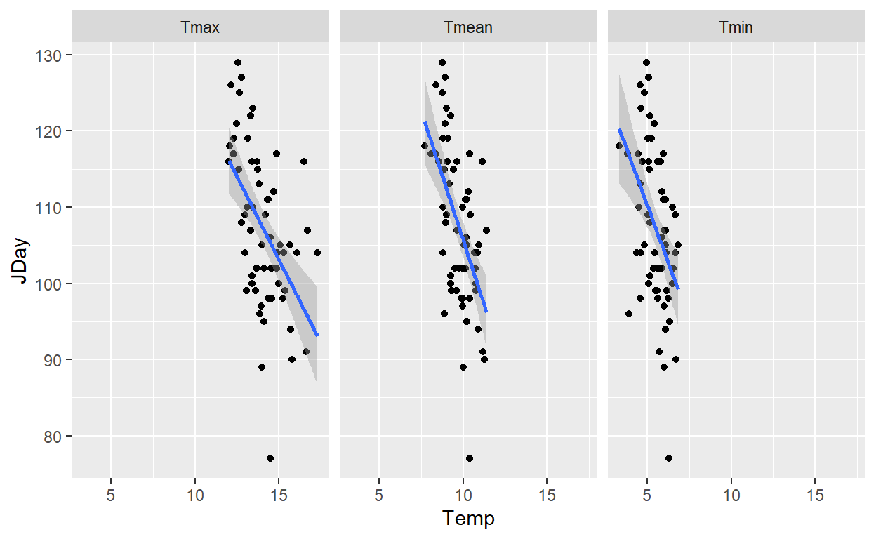
The linear regression indicates that there is a correlation between temperature and bloom date, though this correlation could be driven by climate change rather than just temperature itself.
Regression Analysis for Temperature
To analyze the influence of different temperature variables (Tmin, Tmax, Tmean) on the bloom date, a linear regression is performed for each:
Call:
lm(formula = Annual_means$JDay ~ Annual_means$Tmin)

Residuals:
     Min       1Q   Median       3Q      Max
-25.4960  -6.9227  -0.0472   6.9066  18.4940

Coefficients:
                  Estimate Std. Error t value             Pr(>|t|)
(Intercept)        140.288      8.610  16.293 < 0.0000000000000002
Annual_means$Tmin   -6.020      1.558  -3.864             0.000277

(Intercept)       ***
Annual_means$Tmin ***
---
Signif. codes:  0 '***' 0.001 '**' 0.01 '*' 0.05 '.' 0.1 ' ' 1

Residual standard error: 9.385 on 60 degrees of freedom
Multiple R-squared:  0.1992,    Adjusted R-squared:  0.1859
F-statistic: 14.93 on 1 and 60 DF,  p-value: 0.0002765
Call:
lm(formula = Annual_means$JDay ~ Annual_means$Tmax)

Residuals:
     Min       1Q   Median       3Q      Max
-28.2420  -5.7340   0.3032   5.8515  19.4918

Coefficients:
                  Estimate Std. Error t value             Pr(>|t|)
(Intercept)       168.5020    12.9573  13.004 < 0.0000000000000002
Annual_means$Tmax  -4.3586     0.9198  -4.739            0.0000136

(Intercept)       ***
Annual_means$Tmax ***
---
Signif. codes:  0 '***' 0.001 '**' 0.01 '*' 0.05 '.' 0.1 ' ' 1

Residual standard error: 8.947 on 60 degrees of freedom
Multiple R-squared:  0.2723,    Adjusted R-squared:  0.2602
F-statistic: 22.45 on 1 and 60 DF,  p-value: 0.00001363
Call:
lm(formula = Annual_means$JDay ~ Annual_means$Tmean)

Residuals:
     Min       1Q   Median       3Q      Max
-25.9808  -5.5032   0.3793   6.1267  18.1822

Coefficients:
                   Estimate Std. Error t value             Pr(>|t|)
(Intercept)         173.467     12.379  14.013 < 0.0000000000000002
Annual_means$Tmean   -6.780      1.264  -5.363           0.00000138

(Intercept)        ***
Annual_means$Tmean ***
---
Signif. codes:  0 '***' 0.001 '**' 0.01 '*' 0.05 '.' 0.1 ' ' 1

Residual standard error: 8.623 on 60 degrees of freedom
Multiple R-squared:  0.324, Adjusted R-squared:  0.3128
F-statistic: 28.76 on 1 and 60 DF,  p-value: 0.000001381
Function for Temperature and Bloom Date Correlations
To better capture the effect of temperature on bloom dates, a function is developed to compute correlations over different periods.
temps_JDays <-
  make_JDay(temperature)

corr_temp_pheno <- function(start_JDay, # the start JDay of the period
                            end_JDay, # the start JDay of the period
                            temps_JDay = temps_JDays, # the temperature dataset
                            bloom = Alex_first) # a data.frame with bloom dates
{
  temps_JDay <- temps_JDay %>%
    mutate(Season = Year)

  if(start_JDay > end_JDay)
    temps_JDay$Season[temps_JDay$JDay >= start_JDay]<-
      temps_JDay$Year[temps_JDay$JDay >= start_JDay]+1

  if(start_JDay > end_JDay)
    sub_temps <- subset(temps_JDay,
                        JDay <= end_JDay | JDay >= start_JDay)

  if(start_JDay <= end_JDay)
    sub_temps <- subset(temps_JDay,
                        JDay <= end_JDay & JDay >= start_JDay)

  mean_temps <- sub_temps %>%
    group_by(Season) %>%
    summarise(Tmin = mean(Tmin),
              Tmax = mean(Tmax)) %>%
    mutate(Tmean = (Tmin + Tmax)/2)

  colnames(mean_temps)[1] <- c("Pheno_year")

  temps_bloom <- merge(mean_temps,
                       bloom[c("Pheno_year",
                               "JDay")])

  # Let's just extract the slopes of the regression model for now
  slope_Tmin <- summary(lm(temps_bloom$JDay~temps_bloom$Tmin))$coefficients[2,1]
  slope_Tmean <- summary(lm(temps_bloom$JDay~temps_bloom$Tmean))$coefficients[2,1]
  slope_Tmax <- summary(lm(temps_bloom$JDay~temps_bloom$Tmax))$coefficients[2,1]

  c(start_JDay = start_JDay,
    end_JDay = end_JDay,
    length = length(unique(sub_temps$JDay)),
    slope_Tmin = slope_Tmin,
    slope_Tmean = slope_Tmean,
    slope_Tmax = slope_Tmax)
}
Calculating Correlations for Specific Periods
The function is applied to specific periods:
corr_temp_pheno(start_JDay = 305,
                end_JDay = 45,
                temps_JDay = temps_JDays,
                bloom = Alex_first)
start_JDay end_JDay length slope_Tmin slope_Tmean
305.000000 45.000000 107.000000 -2.254426 -2.655599
slope_Tmax
-2.799758 corr_temp_pheno(start_JDay = 305,
end_JDay = 29,
temps_JDay = temps_JDays,
bloom = Alex_first) start_JDay end_JDay length slope_Tmin slope_Tmean
305.000000 29.000000 91.000000 -1.821312 -2.135616
slope_Tmax
-2.237499 The function can now be applied to various reasonable day ranges. Instead of testing all possible combinations, only every 5th start and end date will be used to balance computational efficiency with thorough analysis.
library(colorRamps)

stJDs <- seq(from = 1,
             to = 366,
             by = 10)

eJDs <- seq(from = 1,
            to = 366,
            by = 10)

for(stJD in stJDs)
  for(eJD in eJDs)
    {correlations <- corr_temp_pheno(stJD,
                                     eJD)

    if(stJD == 1 & eJD == 1)
      corrs <- correlations else
        corrs <- rbind(corrs, correlations)
}


slopes <- as.data.frame(corrs) %>%
  rename(Tmin = slope_Tmin,
         Tmax = slope_Tmax,
         Tmean = slope_Tmean) %>%
  pivot_longer(cols = c(Tmin : Tmax),
               values_to = "Slope",
               names_to = "Variable")
Plotting Correlations
The correlations between temperature and bloom dates for different periods are visualized:
ggplot(data = slopes,
       aes(x = start_JDay,
           y = length,
           fill = Slope)) +
  geom_tile() +
  facet_wrap(vars(Variable)) +
  scale_fill_gradientn(colours = matlab.like(15)) +
  ylab("Interval duration (days)") +
  xlab("Start date of temperature summary interval (Day of year)") +
  theme_bw(base_size = 15)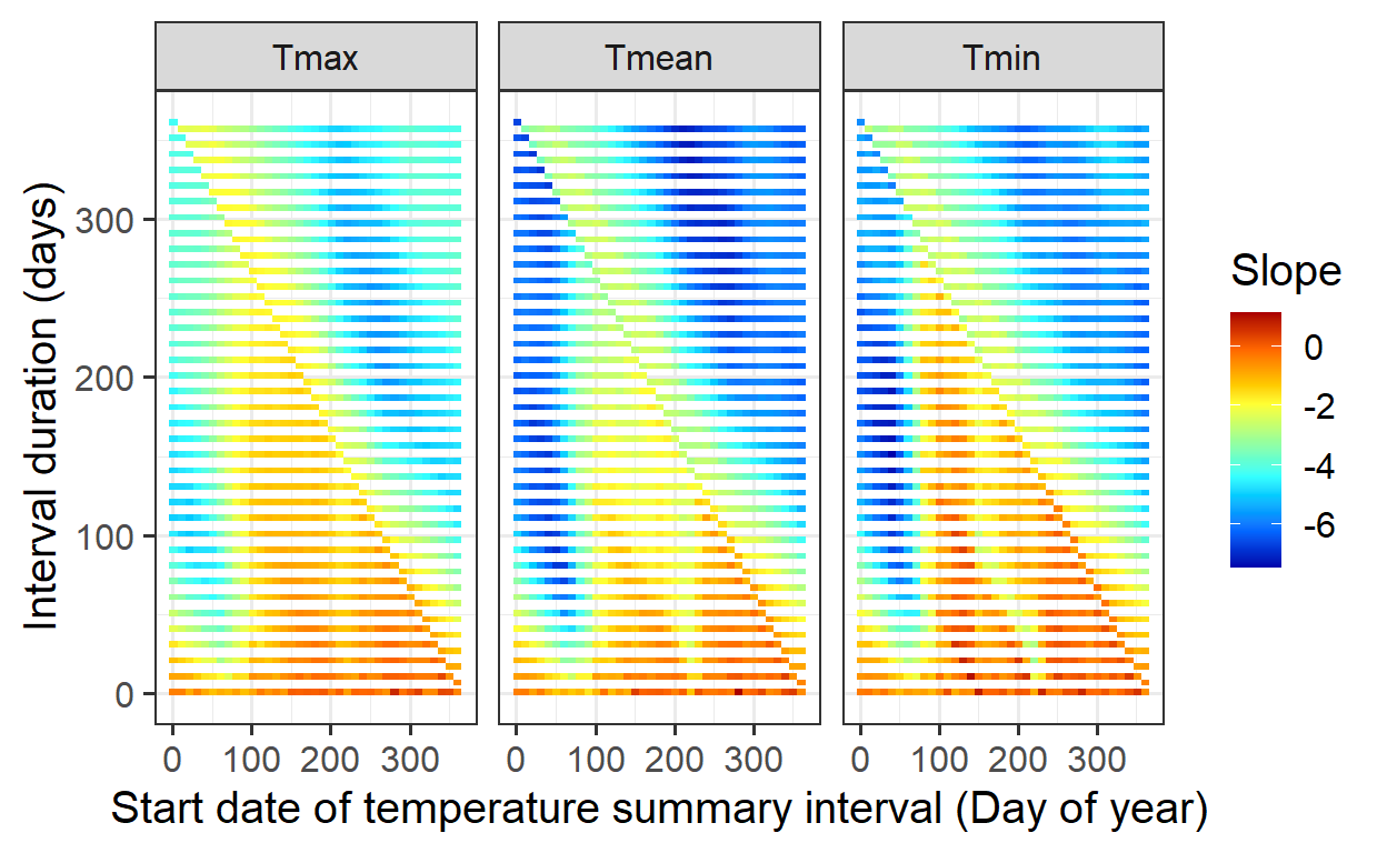
Exercises on simple phenology analysis
- Provide a brief narrative describing what p-hacking is, and why this is a problematic approach to data analysis.
P-hacking is the practice of manipulating data analysis to achieve statistically significant results, often by testing multiple hypotheses or adjusting methods until a low p-value appears. This increases the risk of false positives, leading to misleading conclusions and poor reproducibility. To avoid this, researchers should predefine hypotheses, apply proper statistical corrections, and ensure transparency.
- Provide a sketch of your causal understanding of the relationship between temperature and bloom dates.
A simplified causal diagram for the relationship between temperature and bloom dates is:
Temp_chilling → Chill accumulation → Temp_forcing → Heat accumulation → Bloom Date
- Temp_chilling: Cold temperatures during winter contribute to chill accumulation.
- Chill accumulation: Trees require a certain amount of chilling to end dormancy.
- Temp_forcing: Warmer temperatures in spring promote heat accumulation.
- Heat accumulation: Once enough heat is accumulated, the tree initiates blooming.
- Bloom Date: The final outcome, determined by the balance of chilling and forcing.
- What do we need to know to build a process-based model from this?
A process-based model for bloom timing requires:
- Chilling & Forcing: Defining cold and warm periods, selecting appropriate models, and determining temperature thresholds.
- Temperature Response: Understanding how trees react to temperature changes and how chilling and forcing interact.
- Data for Calibration: Historical bloom records, temperature data, and experimental studies for validation. By parameterizing and testing, the model can be optimized for accurate predictions.