Spring frost
The focus of this chapter is on assessing spring frost risk during flowering. After budbreak, trees become highly vulnerable to frost, with emerging flowers particularly susceptible to damage from freezing temperatures. Since all tree fruits originate from flowers, severe frost damage can result in significant yield losses or even complete crop failure.
In April 2017, a severe spring frost event, with multiple nights reaching around -5°C, caused significant damage to flowers, leading to drastically reduced yields. This event created major challenges for fruit growers. While such occurrences are not unprecedented, it raised concerns about whether climate change is increasing the risk of frost damage.
Unusual weather events are often attributed to climate change, but natural climate variability has always played a role. The key question is whether 2017 was an isolated extreme or an indication of a shifting climate pattern, where spring frosts become more frequent and problematic for growers.
Understanding this risk is crucial for two major decisions in fruit production:
Frost protection investments: Growers can mitigate frost damage using protection strategies like sprinklers, candles, or wind machines. However, these require significant investments, which are only justified if frost events occur frequently. Recent research by Schmitz et al. (2025) evaluated various frost protection measures using a probabilistic decision model.
Cultivar selection: Late-flowering cultivars are generally less exposed to frost risk than early-flowering ones. However, they may have disadvantages, such as lower market prices at harvest or other agronomic trade-offs. A clear understanding of frost risk would help optimize these choices.
This analysis will focus on the experimental station of the University of Bonn at Klein-Altendorf:
leaflet() %>%
  setView(lng = 6.99,
          lat = 50.625,
          zoom = 12) %>%
  addTiles() %>%
  addMarkers(lng = 6.99,
             lat = 50.625,
             popup = "Campus Klein-Altendorf")
Figure 1: Location of Campus Klein-Altendorf, an experimental station of the University of Bonn
A key advantage of this experimental station is its long history of phenology data collection, maintained by multiple generations of technical staff since the 1950s. Additionally, high-quality weather data is available for the entire period. This provides a unique opportunity to conduct a comprehensive frost risk assessment using historical data.
Leveraging this dataset and prior knowledge from this module, the goal is to develop a state-of-the-art frost risk analysis. The first step involves loading long-term weather and bloom datasets into R.
Phenology trend analysis
Here’s what the bloom dataset CKA_Alexander_Lucas looks like:
head(CKA_Alexander_Lucas)| Pheno_year | First_bloom | Full_bloom | Last_bloom |
|---|---|---|---|
| 1958 | 19580502 | 19580503 | 19580507 |
| 1959 | 19590408 | 19590413 | 19590421 |
| 1960 | 19600410 | 19600415 | 19600421 |
| 1961 | 19610330 | 19610408 | 19610415 |
| 1962 | 19620427 | 19620505 | 19620510 |
| 1963 | 19630428 | 19630504 | 19630513 |
To prepare the data for visualization with ggplot, the pivot_longer function is used to reshape the data.frame into the appropriate format. Additionally, Year, Month, and Day columns are calculated. The make_JDay function from chillR is then applied to add the Julian date, which represents the day of the year (e.g., 1 for January 1st, 2 for January 2nd, and 32 for February 1st).
library(tidyverse)

Alexander_Lucas <-
  CKA_Alexander_Lucas %>%
  pivot_longer(cols = "First_bloom":"Last_bloom",
               names_to = "variable",
               values_to="YEARMODA") %>%
  mutate(Year = as.numeric(substr(YEARMODA, 1, 4)),
         Month = as.numeric(substr(YEARMODA, 5, 6)),
         Day = as.numeric(substr(YEARMODA, 7, 8))) %>%
make_JDay() head(Alexander_Lucas)| Pheno_year | variable | YEARMODA | Year | Month | Day | JDay |
|---|---|---|---|---|---|---|
| 1958 | First_bloom | 19580502 | 1958 | 5 | 2 | 122 |
| 1958 | Full_bloom | 19580503 | 1958 | 5 | 3 | 123 |
| 1958 | Last_bloom | 19580507 | 1958 | 5 | 7 | 127 |
| 1959 | First_bloom | 19590408 | 1959 | 4 | 8 | 98 |
| 1959 | Full_bloom | 19590413 | 1959 | 4 | 13 | 103 |
Now, the historic bloom dates can be visualized using ggplot:
ggplot(data = Alexander_Lucas,
       aes(Pheno_year,
           JDay,
           col = variable)) +
  geom_line() +
  theme_bw(base_size = 15) +
  scale_color_discrete(
    name = "Phenological event",
    labels = c("First bloom",
               "Full bloom",
               "Last bloom")) +
  xlab("Phenological year") +
  ylab("Julian date (day of the year)")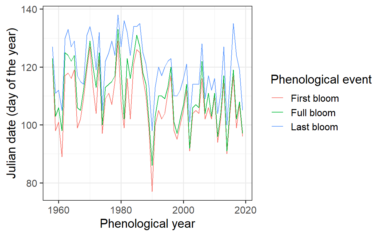
To better visualize trends in bloom dates, a regression line with a standard error can be added using ggplot.
ggplot(data = Alexander_Lucas,
       aes(Pheno_year,
           JDay,
           col = variable)) +
  geom_line() +
  theme_bw(base_size = 15) +
  scale_color_discrete(name = "Phenological event",
                       labels = c("First bloom",
                                  "Full bloom",
                                  "Last bloom")) +
  xlab("Phenological year") +
  ylab("Julian date (day of the year)") +
  geom_smooth(method = "lm")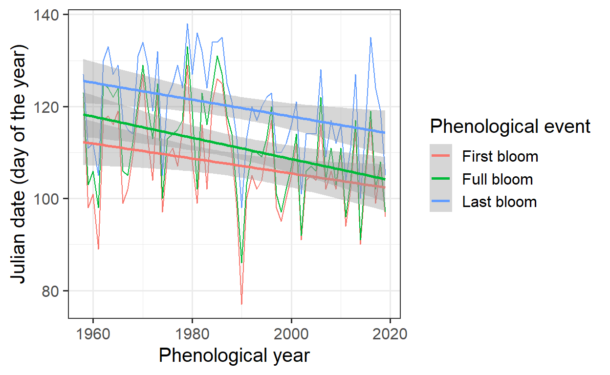
The geom_smooth method can be used to display the data.
ggplot(data=Alexander_Lucas,aes(Pheno_year,JDay,col=variable)) +
  geom_smooth() +
  theme_bw(base_size=15) +
  scale_color_discrete(
    name = "Phenological event",
    labels = c("First bloom", "Full bloom", "Last bloom")) +
  xlab("Phenological year") +
  ylab("Julian date (day of the year)")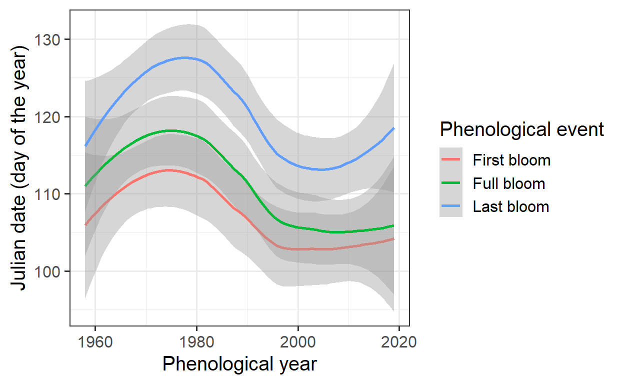
The Kendall test is an effective method for detecting trends in time series data. It helps determine whether the observed changes in bloom dates are statistically significant or just due to random variation.
require(Kendall)
Kendall_first <-
  Kendall(x = Alexander_Lucas$Pheno_year[
            which(Alexander_Lucas$variable == "First_bloom")],
          y = Alexander_Lucas$JDay[
            which(Alexander_Lucas$variable == "First_bloom")])

Kendall_full <-
  Kendall(x = Alexander_Lucas$Pheno_year[
            which(Alexander_Lucas$variable == "Full_bloom")],
          y = Alexander_Lucas$JDay[
            which(Alexander_Lucas$variable == "Full_bloom")])

Kendall_last <-
  Kendall(x = Alexander_Lucas$Pheno_year[
            which(Alexander_Lucas$variable == "Last_bloom")],
          y = Alexander_Lucas$JDay[
            which(Alexander_Lucas$variable == "Last_bloom")])

Kendall_first
tau = -0.186, 2-sided pvalue =0.03533Kendall_fulltau = -0.27, 2-sided pvalue =0.0021401Kendall_lasttau = -0.233, 2-sided pvalue =0.0083237The Kendall test identifies a significant trend in bloom dates, with p-values below 0.05. The negative tau value indicates an advancing bloom trend over time. However, since the test does not quantify the trend’s strength, a linear model is commonly used to estimate the rate of change in bloom dates across the years.
linear_trend_first <- lm(
  Alexander_Lucas$JDay[
    which(Alexander_Lucas$variable == "First_bloom")]~
    Alexander_Lucas$Pheno_year[
      which(Alexander_Lucas$variable == "First_bloom")])

linear_trend_full <- lm(
  Alexander_Lucas$JDay[
    which(Alexander_Lucas$variable == "Full_bloom")]~
    Alexander_Lucas$Pheno_year[
      which(Alexander_Lucas$variable == "First_bloom")])

linear_trend_last <- lm(
  Alexander_Lucas$JDay[
    which(Alexander_Lucas$variable == "Last_bloom")]~
    Alexander_Lucas$Pheno_year[
      which(Alexander_Lucas$variable == "First_bloom")])

linear_trend_first
Call:
lm(formula = Alexander_Lucas$JDay[which(Alexander_Lucas$variable ==
    "First_bloom")] ~ Alexander_Lucas$Pheno_year[which(Alexander_Lucas$variable ==
    "First_bloom")])

Coefficients:
                                                                 (Intercept)
                                                                    429.1662
Alexander_Lucas$Pheno_year[which(Alexander_Lucas$variable == "First_bloom")]
                                                                     -0.1618
linear_trend_full
Call:
lm(formula = Alexander_Lucas$JDay[which(Alexander_Lucas$variable ==
    "Full_bloom")] ~ Alexander_Lucas$Pheno_year[which(Alexander_Lucas$variable ==
    "First_bloom")])

Coefficients:
                                                                 (Intercept)
                                                                    569.6720
Alexander_Lucas$Pheno_year[which(Alexander_Lucas$variable == "First_bloom")]
                                                                     -0.2305
linear_trend_last
Call:
lm(formula = Alexander_Lucas$JDay[which(Alexander_Lucas$variable ==
    "Last_bloom")] ~ Alexander_Lucas$Pheno_year[which(Alexander_Lucas$variable ==
    "First_bloom")])

Coefficients:
                                                                 (Intercept)
                                                                    485.9785
Alexander_Lucas$Pheno_year[which(Alexander_Lucas$variable == "First_bloom")]
                                                                     -0.1841
The second model coefficient provides the rate of change in bloom dates: -0.16 for first bloom, -0.23 for full bloom, and -0.18 for last bloom. To express these shifts per decade, the values are multiplied by 10. This allows for a clearer interpretation of long-term trends in bloom timing.
phenology_trends <-
  data.frame(Stage = c("First bloom",
                       "Full bloom",
                       "Last bloom"),
             Kendall_tau = c(round(Kendall_first[[1]][1],3),
                             round(Kendall_full[[1]][1],3),
                             round(Kendall_last[[1]][1],3)),
             Kendall_p = c(round(Kendall_first[[2]][1],3),
                           round(Kendall_full[[2]][1],3),
                           round(Kendall_last[[2]][1],3)),
             Linear_trend_per_decade =
               c(round(linear_trend_first[[1]][2],2) * 10,
                 round(linear_trend_full[[1]][2],2) * 10,
                 round(linear_trend_last[[1]][2],2) * 10)
)phenology_trends| Stage | Kendall_tau | Kendall_p | Linear_trend_per_decade |
|---|---|---|---|
| First bloom | -0.186 | 0.035 | -1.6 |
| Full bloom | -0.270 | 0.002 | -2.3 |
| Last bloom | -0.233 | 0.008 | -1.8 |
Frost risk
To assess frost risk, a simple frost model will be used, counting any hour with temperatures below 0°C as a frost hour. While bud sensitivity to frost changes over time—dormant buds can withstand deep freezes, but sensitivity increases as development progresses—this model will not account for these complexities. Given previous experience with temperature models, implementing this should be straightforward. The help file for step_model can provide guidance if needed.
frost_df = data.frame(
  lower = c(-1000, 0),
  upper = c(0, 1000),
  weight = c(1, 0))

frost_model <- function(x) step_model(x,
                                      frost_df)
The next step is to apply the frost model to historical data. Before doing so, the temperature records need to be converted to hourly values:
hourly <- stack_hourly_temps(CKA_weather,
                             latitude = 50.625)

frost <- tempResponse(hourly,
                      models = c(frost = frost_model))

ggplot(frost,
       aes(End_year,
           frost)) +
  geom_smooth() +
  geom_point() +
  ylim(c(0, NA)) +
  ylab("Frost hours per year") +
  xlab("Year")
The data indicates a significant decline in the number of frost hours at Klein-Altendorf. This trend can be quantified using statistical measures such as the Kendall test for trend detection and a linear regression model to estimate the rate of change over time.
Kendall(x = frost$End_year,
        y = frost$frost)
tau = -0.179, 2-sided pvalue =0.041862lm(frost$frost ~ frost$End_year)
Call:
lm(formula = frost$frost ~ frost$End_year)

Coefficients:
   (Intercept)  frost$End_year
      11172.57           -5.19
On average, assuming a linear decline, there has been a reduction of approximately -5.2 frost hours per year. While historic scenarios of frost hour numbers could be created using previous methods, the focus here is on assessing the impact of spring frost on pear trees. Instead of aggregating frost hours for the entire year, daily frost occurrence data is needed to compare with bloom dates. This requires a modified version of the frost model.
frost_model_no_summ <-
  function(x) step_model(x,
                         frost_df,
                         summ=FALSE)

hourly$hourtemps[, "frost"] <- frost_model_no_summ(hourly$hourtemps$Temp)

Daily_frost_hours <- aggregate(hourly$hourtemps$frost,
                               by = list(hourly$hourtemps$YEARMODA),
                               FUN = sum)

Daily_frost <- make_JDay(CKA_weather)

Daily_frost[, "Frost_hours"] <- Daily_frost_hours$x
To determine whether an individual hour experienced frost, a frost model is needed that does not automatically sum up all frost hours. This requires modifying the step_model function by setting the summ parameter to FALSE, allowing the model to be applied directly to hourly temperatures.
Instead of plotting data by hour, it is more practical to summarize it by day. This can be done using the aggregate function, which sums values for specific data.frame columns that meet certain criteria. The make_JDay function is then used to add Julian dates to the dataset, and daily frost hour data is stored in a new column.
For visualization, the bloom and frost data should be plotted on the same axes: Year and Julian Day (JDay). Since the number of frost hours needs to be represented as well, dots of varying sizes can be used. To avoid displaying days with zero frost hours, these values should first be set to NA before plotting with ggplot.
Daily_frost$Frost_hours[which(Daily_frost$Frost_hours == 0)] <- NA

ggplot(data = Daily_frost,
       aes(Year,
           JDay,
           size = Frost_hours)) +
  geom_point(col = "light blue",
             alpha = 0.8) +
  scale_size(range = c(0, 3),
             breaks = c(1, 5, 10, 15, 20),
             labels = c("1", "5", "10", "15", "20"),
             name = "Frost hours") +
  theme_bw(base_size = 15)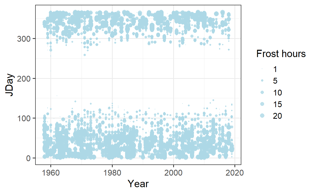
Bloom dates and frost hours are plotted together, with dot sizes indicating frost hours:
ggplot(data = Alexander_Lucas,
       aes(Pheno_year,
           JDay,
           col = variable)) +
  geom_line() +
  theme_bw(base_size = 15) +
  scale_color_discrete(
    name = "Phenological event",
    labels = c("First bloom",
               "Full bloom",
               "Last bloom")) +
  xlab("Phenological year") +
  ylab("Julian date (day of the year)") +
  geom_point(data = Daily_frost,
             aes(Year,
                 JDay,
                 size = Frost_hours),
             col = "light blue",
             alpha = 0.8) +
  scale_size(range = c(0, 3),
             breaks = c(1, 5, 10, 15, 20),
             labels = c("1", "5", "10", "15", "20"),
             name = "Frost hours") +
  theme_bw(base_size = 15)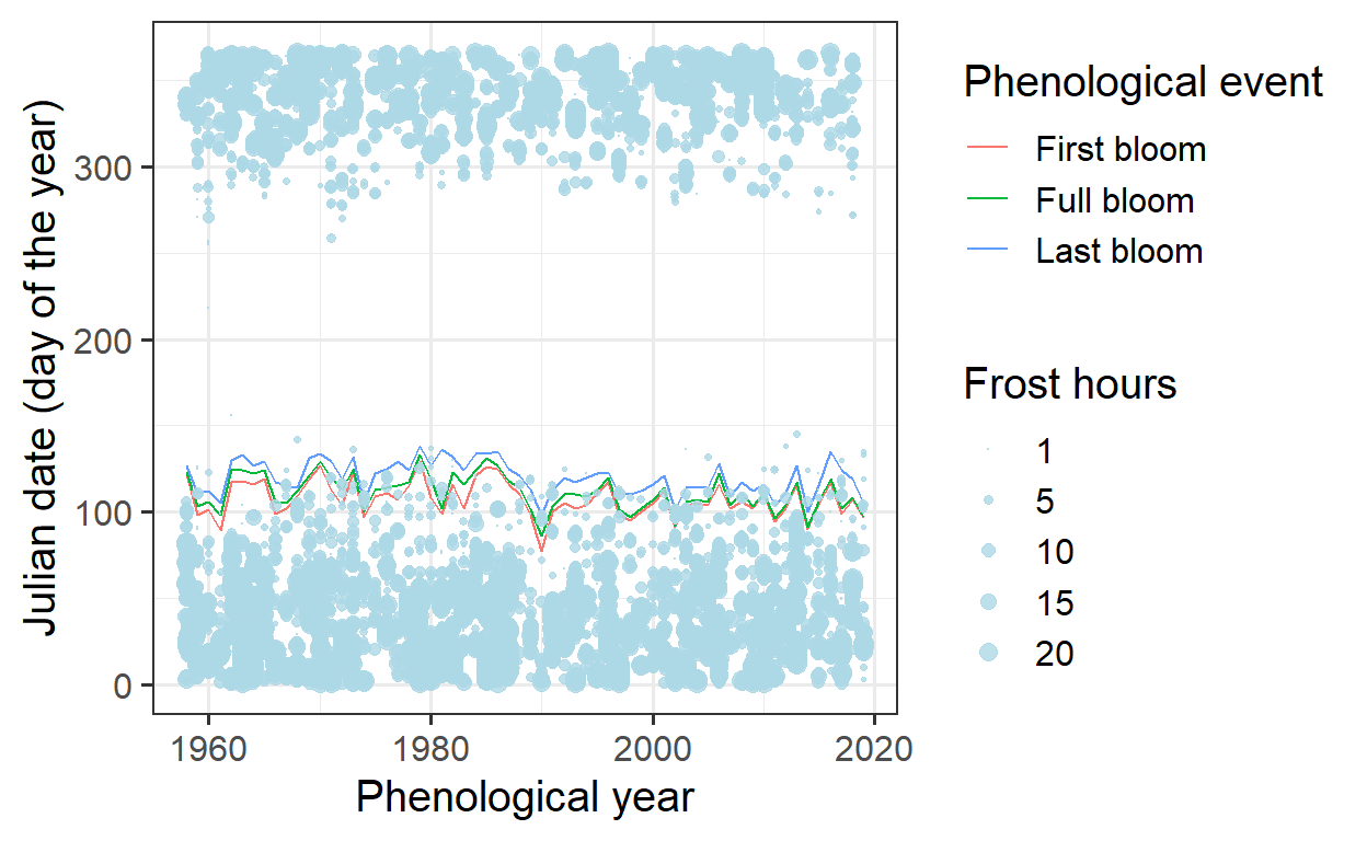
To improve clarity, only spring data will be displayed in the plot:
ggplot(data = Alexander_Lucas,
       aes(Pheno_year,
           JDay,
           col = variable)) +
  geom_line() +
  theme_bw(base_size = 15) +
  scale_color_discrete(
    name = "Phenological event",
    labels = c("First bloom",
               "Full bloom",
               "Last bloom")) +
  xlab("Phenological year") +
  ylab("Julian date (day of the year)") +
  geom_point(data = Daily_frost,
             aes(Year,
                 JDay,
                 size = Frost_hours),
             col = "light blue",
             alpha = 0.8) +
  scale_size(range = c(0, 3),
             breaks = c(1, 5, 10, 15, 20),
             labels = c("1", "5", "10", "15", "20"),
             name = "Frost hours") +
  theme_bw(base_size = 15) +
  ylim(c(75, 140))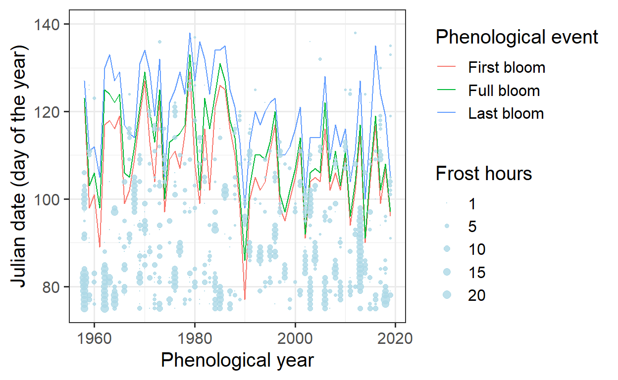
To enhance visibility, a ribbon will represent the total bloom duration, while a line will indicate full bloom. Some data restructuring is required for this adjustment:
Ribbon_Lucas <-
  Alexander_Lucas %>%
  select(Pheno_year, variable, JDay) %>%
  pivot_wider(names_from = "variable", values_from = "JDay")


ggplot(data = Ribbon_Lucas,
       aes(Pheno_year)) +
  geom_ribbon(aes(ymin = First_bloom,
                  ymax = Last_bloom),
              fill = "light gray") +
  geom_line(aes(y = Full_bloom)) +
  theme_bw(base_size = 15) +
  xlab("Phenological year") +
  ylab("Julian date (day of the year)") +
  geom_point(data = Daily_frost,
             aes(Year,
                 JDay,
                 size = Frost_hours),
             col = "light blue",
             alpha = 0.8) +
  scale_size(range = c(0, 3),
             breaks = c(1, 5, 10, 15, 20),
             labels = c("1", "5", "10", "15", "20"),
             name = "Frost hours") +
  theme_bw(base_size = 15) +
  ylim(c(75, 140))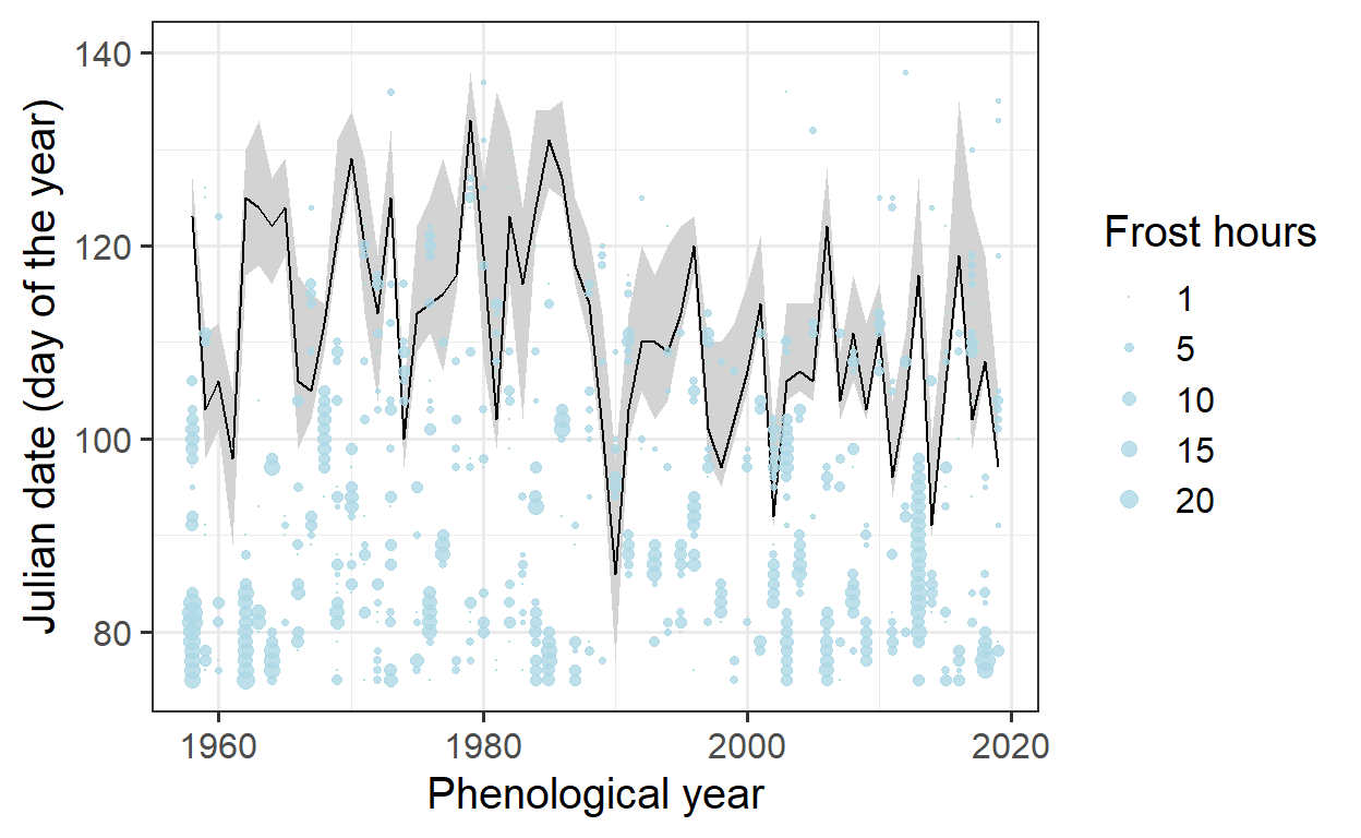
To improve visibility, color will be used to highlight instances where frost events coincided with bloom.
# identify frost events that overlap with bloom
lookup_dates <- Ribbon_Lucas

row.names(lookup_dates) <- lookup_dates$Pheno_year

Daily_frost[, "First_bloom"]<-
  lookup_dates[as.character(Daily_frost$Year),
               "First_bloom"]

Daily_frost[, "Last_bloom"]<-
  lookup_dates[as.character(Daily_frost$Year),
               "Last_bloom"]

Daily_frost[which(!is.na(Daily_frost$Frost_hours)),
            "Bloom_frost"] <-
  "Before bloom"

Daily_frost[which(Daily_frost$JDay >= Daily_frost$First_bloom),
            "Bloom_frost"]<-
  "During bloom"

Daily_frost[which(Daily_frost$JDay > Daily_frost$Last_bloom),
            "Bloom_frost"]<-
  "After bloom"

Daily_frost[which(Daily_frost$JDay > 180),
            "Bloom_frost"]<-
  "Before bloom"

ggplot(data = Ribbon_Lucas,
       aes(Pheno_year)) +
  geom_ribbon(aes(ymin = First_bloom,
                  ymax = Last_bloom),
              fill = "light gray") +
  geom_line(aes(y = Full_bloom)) +
  theme_bw(base_size = 15) +
  xlab("Phenological year") +
  ylab("Julian date (day of the year)") +
  geom_point(data = Daily_frost,
             aes(Year,
                 JDay,
                 size = Frost_hours,
                 col = Bloom_frost),
             alpha = 0.8) +
  scale_size(range = c(0, 5),
             breaks = c(1, 5, 10, 15, 20),
             labels = c("1", "5", "10", "15", "20"),
             name = "Frost hours") +
  scale_color_manual(
    breaks = c("Before bloom",
               "During bloom",
               "After bloom"),
    values = c("light green",
               "red",
               "light blue"),
    name = "Frost timing") +
  theme_bw(base_size = 15) +
  ylim(c(75, 140))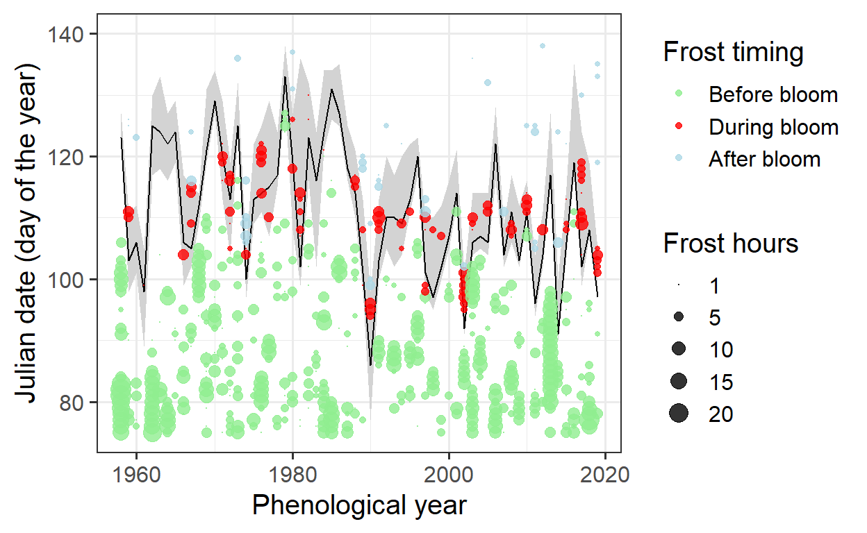
The analysis now focuses on the long-term trend in frost hours during the bloom period:
Bloom_frost_trend <-
  aggregate(
    Daily_frost$Frost_hours,
    by = list(Daily_frost$Year,
              Daily_frost$Bloom_frost),
    FUN = function(x) sum(x,
                          na.rm = TRUE))

colnames(Bloom_frost_trend) <- c("Year",
                                 "Frost_timing",
                                 "Frost_hours")

DuringBloom<-
  Bloom_frost_trend[
    which(Bloom_frost_trend$Frost_timing == "During bloom"),]

ggplot(data = DuringBloom,
       aes(Year,
           Frost_hours)) +
  geom_col() +
  ylab("Frost hours")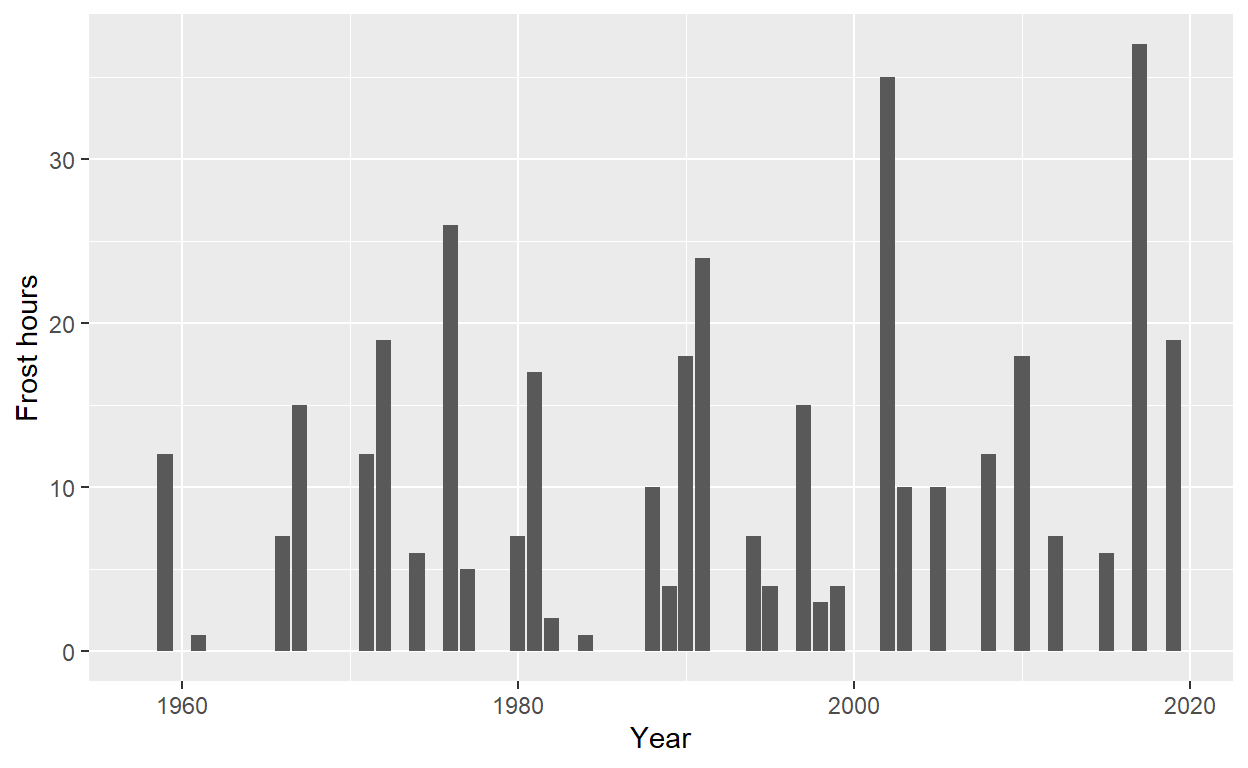
To determine if there is a trend in frost hours during bloom, statistical analysis is needed:
Kendall(x = DuringBloom$Year,
        y = DuringBloom$Frost_hours)
tau = 0.0834, 2-sided pvalue =0.3797lm(DuringBloom$Frost_hours ~ DuringBloom$Year)
Call:
lm(formula = DuringBloom$Frost_hours ~ DuringBloom$Year)

Coefficients:
     (Intercept)  DuringBloom$Year
      -159.07879           0.08302
The regression slope suggests an average annual increase of 0.08 frost hours during bloom. However, the Kendall test does not indicate a significant trend.
Exercises on frost risk analysis
- Download the phenology dataset for the apple cultivar Roter Boskoop from Klein-Altendorf.
CKA_Roter_Boskoop <- read_tab("data/Roter_Boskoop_bloom_1958_2019.csv")


Roter_Boskoop <- CKA_Roter_Boskoop %>%
  pivot_longer(cols = "First_bloom":"Last_bloom",
               names_to = "variable",
               values_to="YEARMODA") %>%
  mutate(Year = as.numeric(substr(YEARMODA, 1, 4)),
         Month = as.numeric(substr(YEARMODA, 5, 6)),
         Day = as.numeric(substr(YEARMODA, 7, 8))) %>%
make_JDay() - Illustrate the development of the bloom period over the duration of the weather record. Use multiple ways to show this - feel free to be creative.
# Line chart with trend line
ggplot(data = Roter_Boskoop,aes(Pheno_year, JDay, col = variable)) +
  geom_smooth() +
  theme_bw(base_size=15) +
  scale_color_discrete(
    name = "Phenological event",
    labels = c("First bloom", "Full bloom", "Last bloom")) +
  xlab("Phenological year") +
  ylab("Julian date (day of the year)")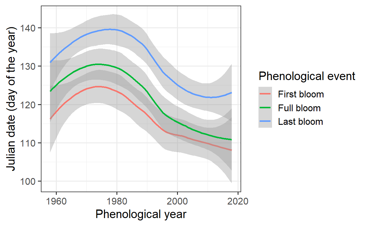
Trend analysis of phenological events for ‘Roter Boskoop’ over time. The x-axis represents the phenological year, while the y-axis shows the Julian day of blooming events. The colored lines indicate smoothed trends for the three key phenological stages: first bloom, full bloom, and last bloom.
# Boxplots of Bloom Period by Decade

library(ggplot2)
library(dplyr)
library(forcats)

# Define colors for boxplots
colors <- c("#b2182b", "#d6604d", "#f4a582", "#fdae61", "#92c5de", "#4393c3", "#2166ac")


# Calculate decades
Roter_Boskoop <- Roter_Boskoop %>%
  mutate(Decade = cut(Year, breaks = seq(1950, 2020, by = 10), labels = seq(1950, 2010, by = 10)))

# Create boxplots
ggplot(Roter_Boskoop, aes(x = as.factor(Decade), y = JDay, fill = Decade)) +
  stat_boxplot(geom = "errorbar", width = 0.4, lwd = 0.5) +
  geom_boxplot(outlier.color = "black",
               outlier.shape = 16,
               outlier.size = 1.5,
               lwd = 0.6,
               fatten = 1.2) +
  scale_fill_manual(values = colors) +
  labs(x = "Decade",
       y = "Julian date (day of the year)",
       fill = "Decade") +
  theme_bw(base_size = 15, base_family = "Arial") +
  theme(
    legend.position = "none",
panel.border = element_rect(color = "black", fill = NA, size = 0.5)) 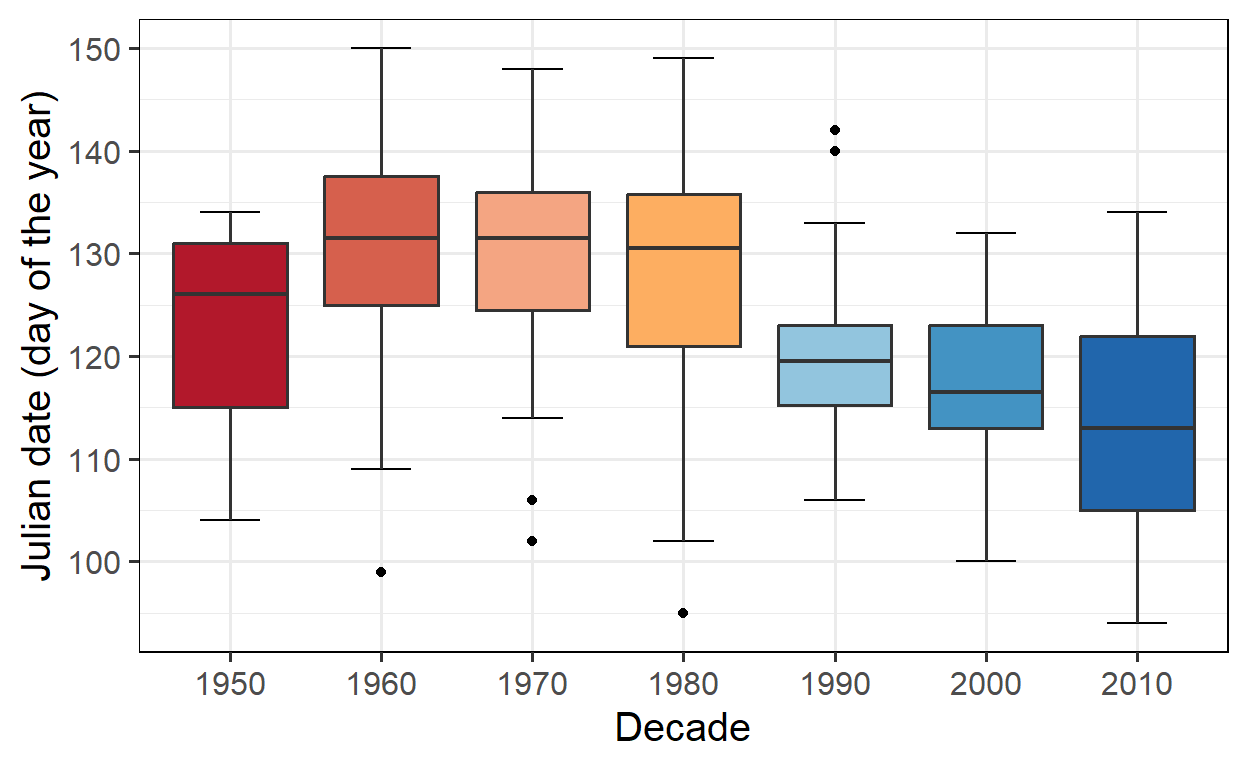
Boxplot of the blooming period of ‘Roter Boskoop’ across decades. The x-axis represents different decades from 1950 to 2010, while the y-axis shows the Julian day of blooming events. Each boxplot visualizes the distribution of blooming dates within a decade, including the median, interquartile range, and potential outliers.
# Heatmap for Bloom density
ggplot(Roter_Boskoop, aes(x = Year, y = JDay)) +
  geom_bin2d(bins = 30) +
  scale_fill_gradientn(colors = c("yellow", "orange", "red"), name = "Density") +
  labs(x = "Year",
       y = "Julian Day") +
  theme_bw(base_size = 15) +
  theme(panel.border = element_rect(color = "black", fill = NA, size = 0.5))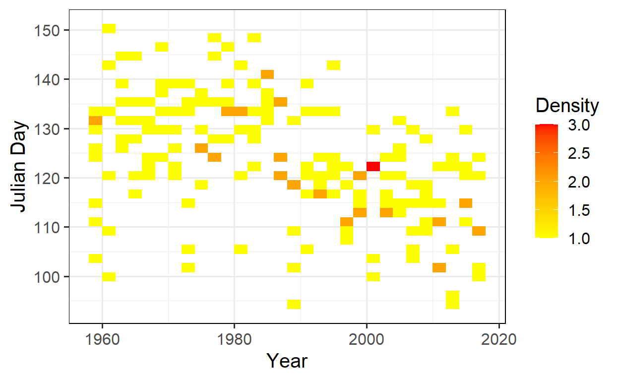
Heatmap of bloom density for ‘Roter Boskoop’ over the years. The x-axis represents the year, while the y-axis shows the Julian day on which blooming events were observed. The color scale from yellow to red indicates the density of observations, with red areas representing a higher frequency of blooming events.
- Evaluate the occurrence of frost events at Klein-Altendorf since 1958. Illustrate this in a plot.
# Generating model for frost hours (temperatures < 0°C)
frost_df = data.frame(
  lower = c(-1000, 0),
  upper = c(0, 1000),
  weight = c(1, 0))

frost_model <- function(x) step_model(x,
                                      frost_df)

# Convert temperature record to hourly values
hourly <- stack_hourly_temps(CKA_weather,
                             latitude = 50.625)

frost <- tempResponse(hourly,
                      models = c(frost = frost_model))

# Plot number of frost hours
ggplot(frost,
       aes(End_year,
           frost)) +
  geom_smooth() +
  geom_point() +
  ylim(c(0, NA)) +
  ylab("Frost hours per year") +
  xlab("Year")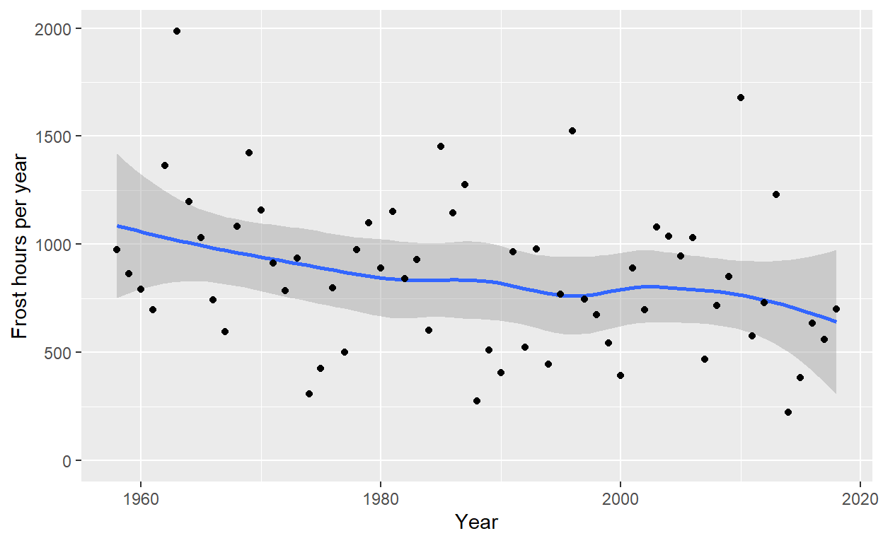
- Produce an illustration of the relationship between spring frost events and the bloom period of ‘Roter Boskoop’.
# Ribbon for total bloom duration
Ribbon_Boskoop <-
  Roter_Boskoop %>%
  select(Pheno_year, variable, JDay) %>%
  pivot_wider(names_from = "variable", values_from = "JDay")

# Identify frost events that overlap with bloom
lookup_dates <- Ribbon_Boskoop

row.names(lookup_dates) <- lookup_dates$Pheno_year

Daily_frost[, "First_bloom"]<-
  lookup_dates[as.character(Daily_frost$Year),
               "First_bloom"]

Daily_frost[, "Last_bloom"] <-
  lookup_dates[as.character(Daily_frost$Year),
               "Last_bloom"]

Daily_frost[which(!is.na(Daily_frost$Frost_hours)),
            "Bloom_frost"] <-
  "Before bloom"

Daily_frost[which(Daily_frost$JDay >= Daily_frost$First_bloom),
            "Bloom_frost"] <-
  "During bloom"

Daily_frost[which(Daily_frost$JDay > Daily_frost$Last_bloom),
            "Bloom_frost"] <-
  "After bloom"

Daily_frost[which(Daily_frost$JDay > 180),
            "Bloom_frost"] <-
  "Before bloom"
# Plot spring frost events that coincided with bloom
ggplot(data = Ribbon_Boskoop,
aes(Pheno_year)) +
geom_ribbon(aes(ymin = First_bloom,
ymax = Last_bloom),
fill = "light gray") +
geom_line(aes(y = Full_bloom)) +
theme_bw(base_size = 15) +
xlab("Phenological year") +
ylab("Julian date (day of the year)") +
geom_point(data = Daily_frost,
aes(Year,
JDay,
size = Frost_hours,
col = Bloom_frost),
alpha = 0.8) +
scale_size(range = c(0, 5),
breaks = c(1, 5, 10, 15, 20),
labels = c("1", "5", "10", "15", "20"),
name = "Frost hours") +
scale_color_manual(
breaks = c("Before bloom",
"During bloom",
"After bloom"),
values = c("light green",
"red",
"light blue"),
name = "Frost timing") +
theme_bw(base_size = 15) +
ylim(c(75, 140))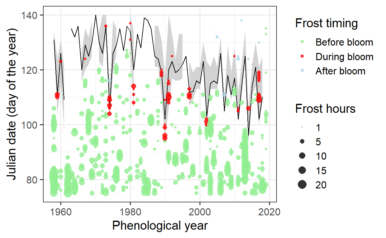
- Evaluate how the risk of spring frost for this cultivar has changed over time. Has there been a significant trend?
# Investigate if there is a long-term trend in the number of frost hours during bloom
Bloom_frost_trend <-
  aggregate(
    Daily_frost$Frost_hours,
    by = list(Daily_frost$Year,
              Daily_frost$Bloom_frost),
    FUN = function(x) sum(x,
                          na.rm = TRUE))

colnames(Bloom_frost_trend) <- c("Year",
                                 "Frost_timing",
                                 "Frost_hours")

DuringBloom <-
  Bloom_frost_trend[
    which(Bloom_frost_trend$Frost_timing == "During bloom"),]

ggplot(data = DuringBloom,
       aes(Year,
           Frost_hours)) +
  geom_col() +
  ylab("Frost hours")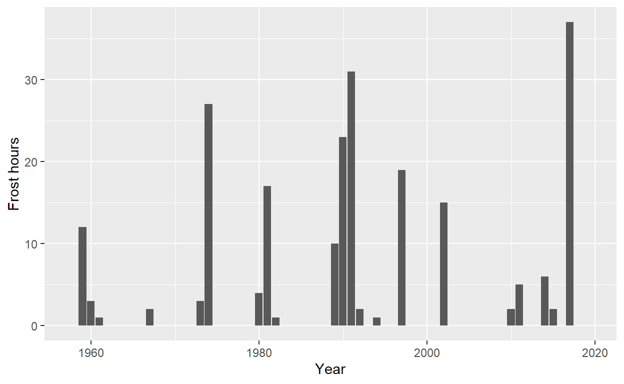
# Performing Kendall test
Kendall(x = DuringBloom$Year,
        y = DuringBloom$Frost_hours)
tau = 0.0176, 2-sided pvalue =0.86236# Performing linear model
lm(DuringBloom$Frost_hours ~ DuringBloom$Year)
Call:
lm(formula = DuringBloom$Frost_hours ~ DuringBloom$Year)

Coefficients:
     (Intercept)  DuringBloom$Year
       -75.87112           0.03996
The slope of the regression suggests an average increase of 0.04 frost hours during bloom per year. However, the Kendall test (τ = 0.0176, p = 0.862) indicates that this trend is not statistically significant.